BRAND STRATEGY ADVERTISING CREATIVE AI

ZENGANI
MWALE.

I turn ideas into brands, campaigns and visual experiences people want to engage with.
Explore my work
Selected brands,
projects & creative worlds
AI CREATIVE LAB / 02

IDEAS IN
MOTION.

Art Direction → AI → Motion
ABOUT / 03
STRATEGY
MEETS
IMAGINATION.
I’m Zengani Mwale. I’m interested in ideas that do more than look good — they should make sense, solve something and leave an impression. I work across brand strategy, advertising, digital storytelling and emerging creative AI.
Learning & Development

Skills &
Certifications.

Continuous learning across digital marketing and digital experience design — strengthening the strategic and creative thinking behind my work.

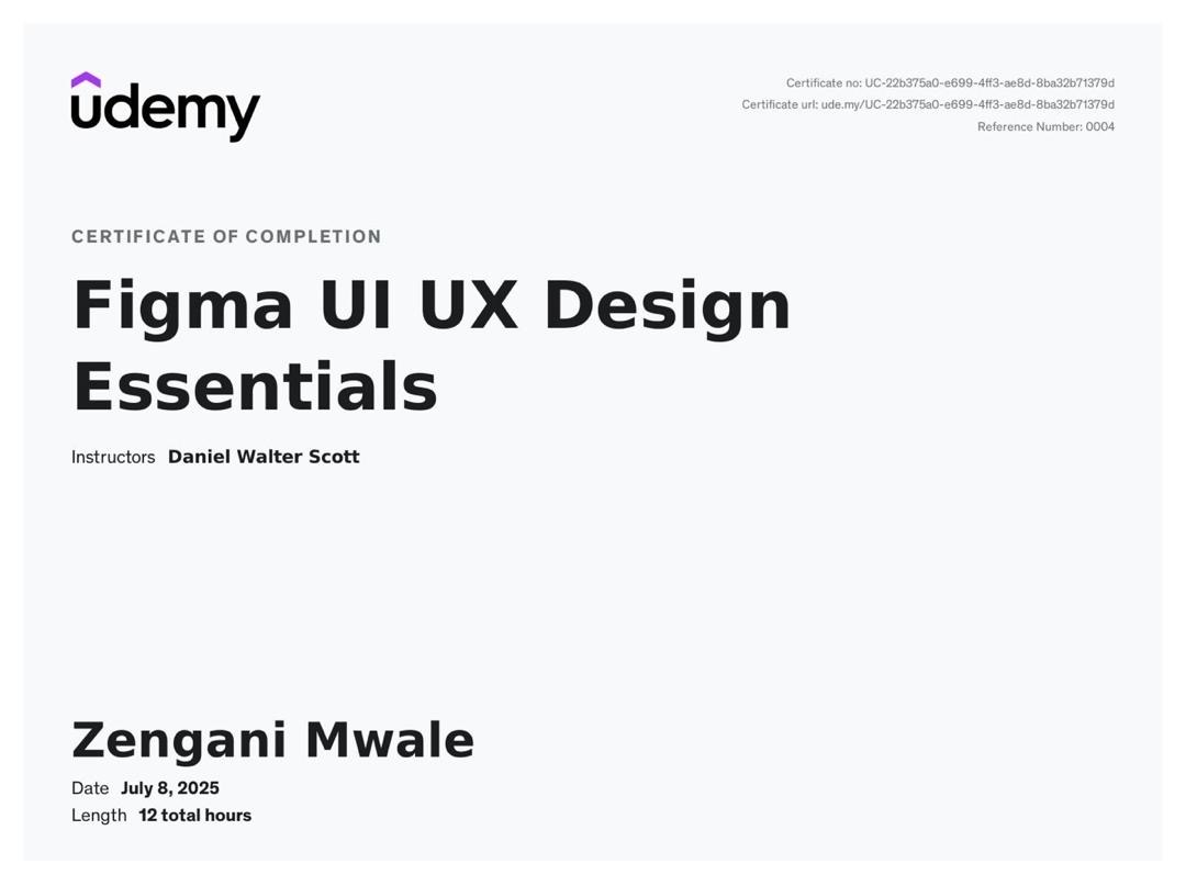
Figma UI UX Design Essentials certificate
Udemy · July 2025
Figma UI/UX Design Essentials
Certificate of Completion
Practical training in Figma and UI/UX design covering user-centered design, responsive wireframing, interface design and high-fidelity mockups.
FigmaUI DesignUX DesignWireframingPrototyping
Credential ID: UC-22b375a0-e699-4ff3-ae8d-8ba32b71379d
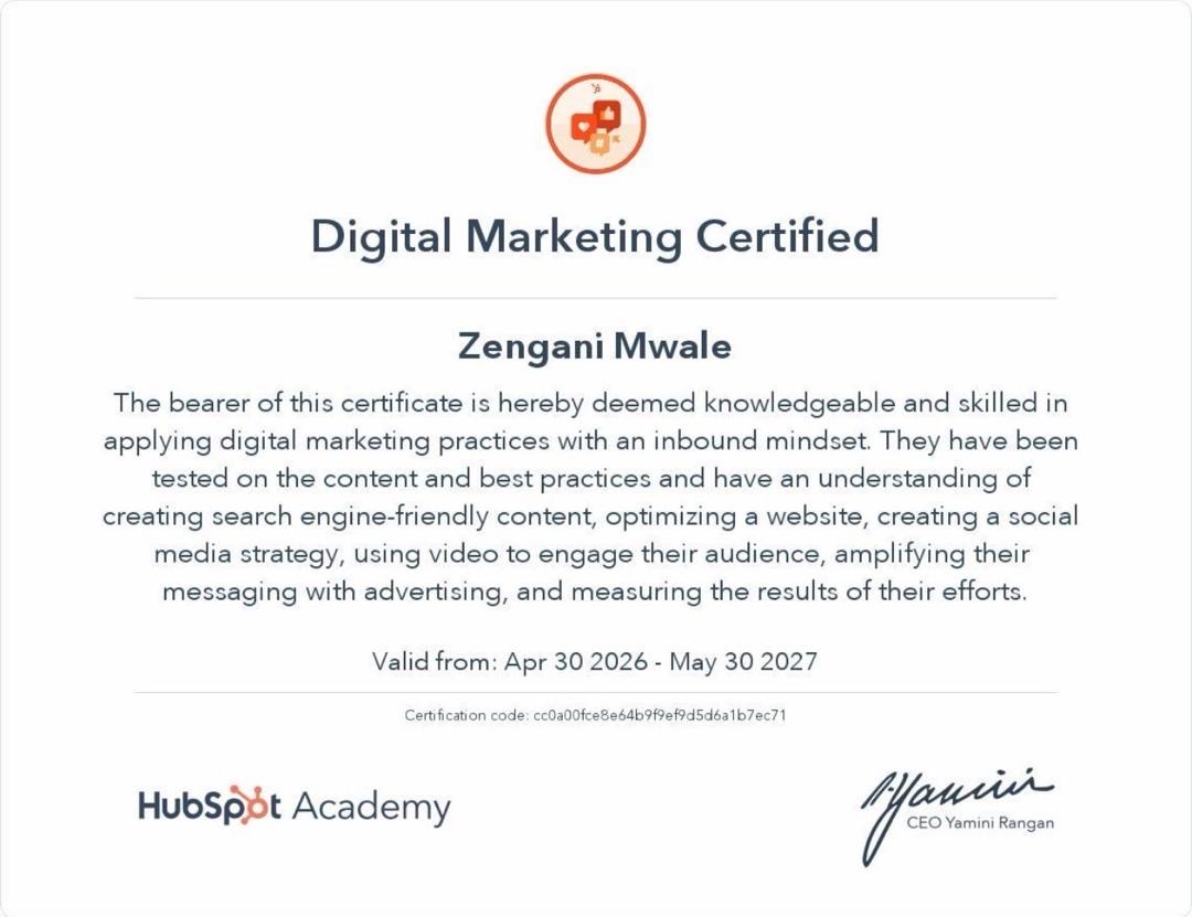
HubSpot Academy Digital Marketing certification
HubSpot Academy · April 2026
Digital Marketing
Certified · Valid through May 2027
Certification covering digital marketing with an inbound mindset, including SEO-friendly content, website optimization, social media strategy, video, digital advertising and performance measurement.
Digital MarketingSEOSocial MediaContentAnalytics
Credential ID: cc0a00fce8e64b9f9ef9d5d6a1b7ec71
← Back to Work
ZM® / SEE BEYOND SIGHT
Close ×
COMMUNITY SERVICE · DESIGN TEAM

SEE
BEYOND
SIGHT.

See Beyond Sight was a community service campaign conducted at Xiamen University Malaysia to raise awareness about people who are visually impaired.

ProjectCommunity Service
RoleDesign Department
Date28 November 2025
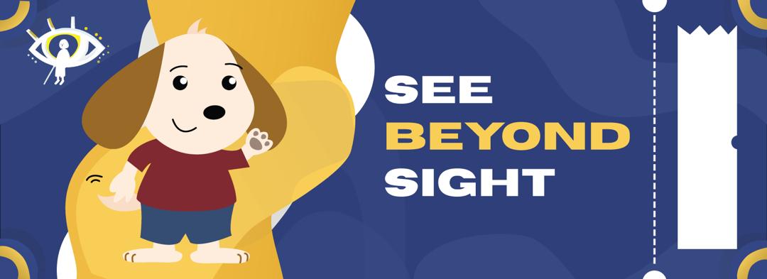
See Beyond Sight identity
01 / IDENTITY

A VISUAL LANGUAGE BUILT AROUND SIGHT.

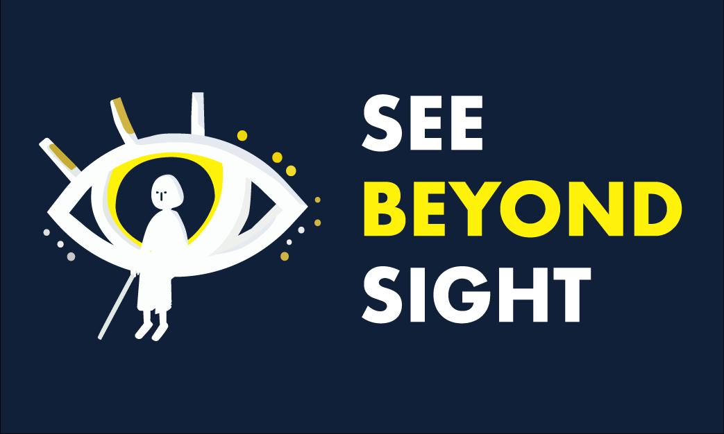
The project identity uses the eye as its central symbol, paired with a human figure and walking cane. Navy, white and yellow create a clear, high-contrast visual system that carries across the project branding.

See Beyond Sight logo on navy See Beyond Sight eye symbol See Beyond Sight dark logo See Beyond Sight horizontal identity
02 / APPLICATION

FROM IDENTITY TO PROJECT MATERIALS.

The visual system was adapted into different communication formats, maintaining the recognisable eye symbol, typography and colour palette across the project.

See Beyond Sight project application
03 / MY ROLE

DESIGN TEAM CONTRIBUTION.

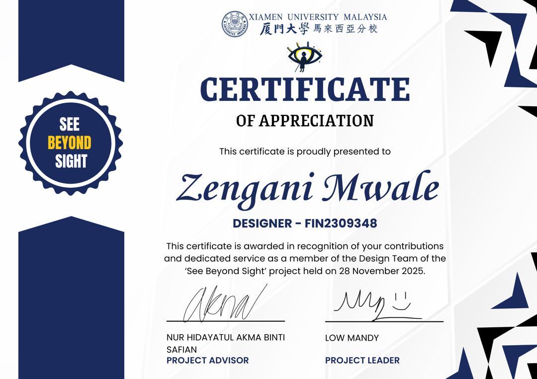
As part of the Design Department, I designed the campaign logo and supporting visual elements, created the event stamp card and brochure, and coordinated with my team members on designs for the campaign’s social media.

Certificate of appreciation for Zengani Mwale
Community Service Project

DESIGN WITH A PURPOSE.

My role covered both individual design work and team coordination, helping keep the campaign’s visual communication consistent across event materials and social media.

04 / TEAM

BUILT COLLABORATIVELY.

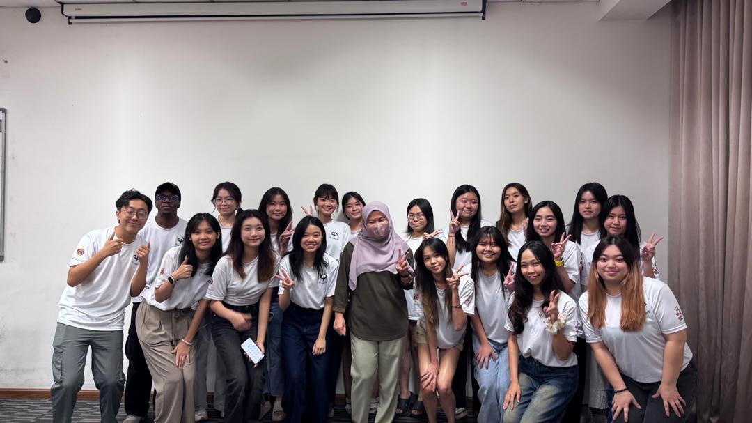
See Beyond Sight was delivered collaboratively. Within the Design Department, I worked with other team members to develop social media designs while also creating key campaign materials including the logo, visual elements, stamp card and brochure.

See Beyond Sight project team
BRAND IDENTITY · LOGO DESIGN

LALIKA
LUXURY
RESORT.

A contemporary luxury identity inspired by architectural symmetry, balance and refined resort experiences.

ProjectBrand Identity
SoftwareAdobe Illustrator
FocusLogo · Visual System
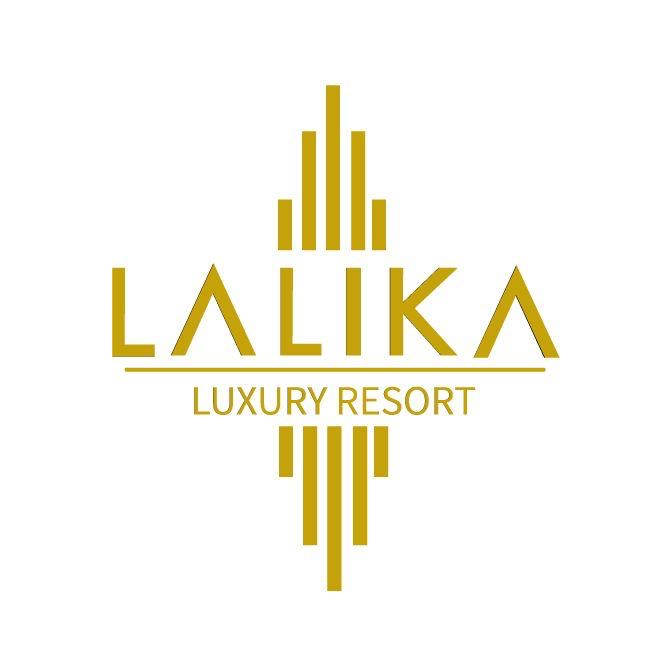
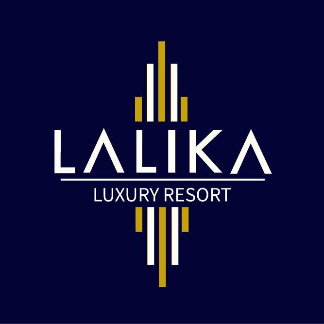
Lalika Luxury Resort primary logo
01 / PROCESS

BUILDING A LUXURY IDENTITY.

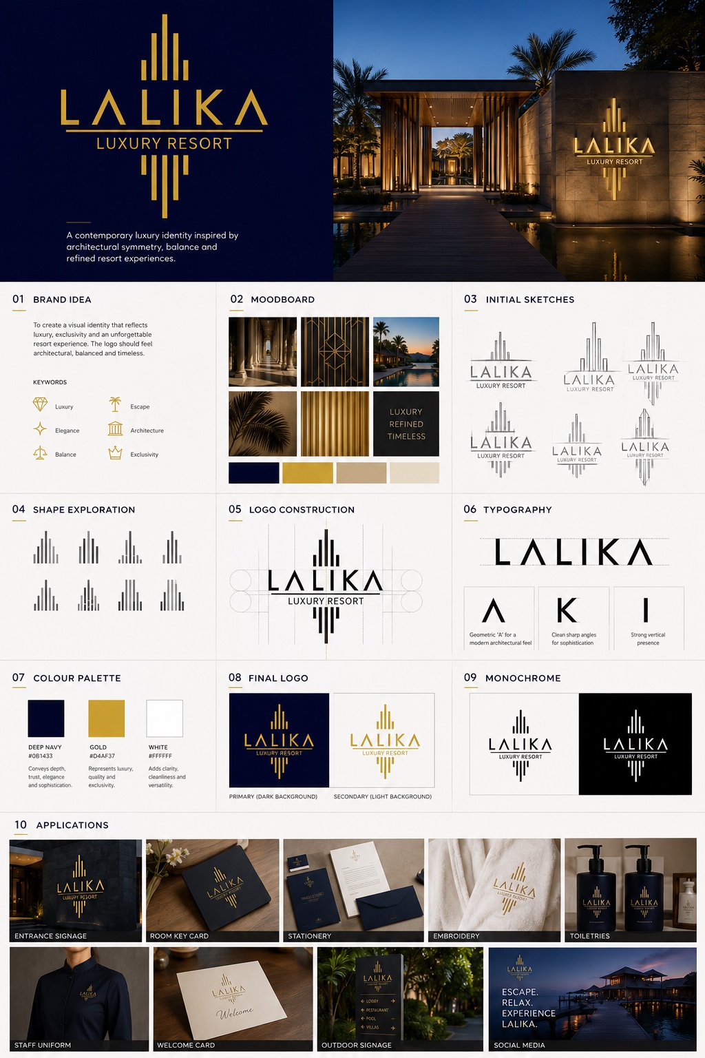
The identity was developed around luxury, exclusivity, elegance, architecture, balance and escape. The process moved from moodboard references and initial sketches into shape exploration, logo construction, typography and colour.

Lalika brand identity development board
02 / EXECUTION

DESIGNED IN ADOBE ILLUSTRATOR.

The logo and visual identity were created using Adobe Illustrator, allowing the geometric mark, custom letterforms and architectural proportions to be constructed as a clean vector system suitable for signage, stationery, uniforms and hospitality applications.

Adobe Illustrator
03 / FINAL IDENTITY

NAVY, GOLD & ARCHITECTURAL BALANCE.

The final system pairs deep navy with gold and white. The vertical geometric symbol creates a strong architectural presence while the customised LALIKA wordmark keeps the identity modern and refined.

Lalika logo on navyLalika logo on white
← Back to Work
ZM® / GOLDEN DODO
Close ×
COMMUNICATION CAMPAIGN · DODODOTS PIMPLE PATCHES

FIND THE
GOLDEN DODO.

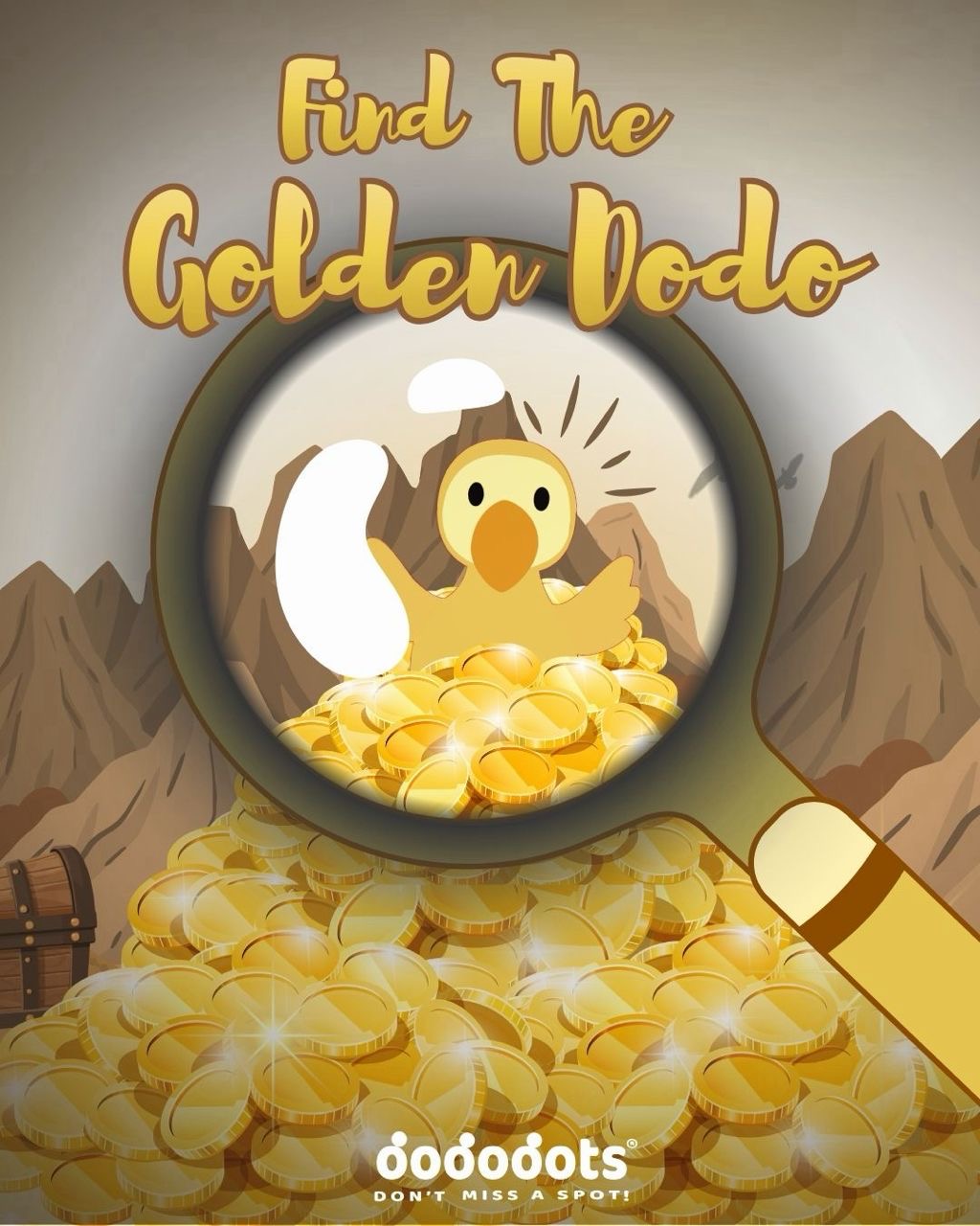
A treasure-hunt style campaign that turns acne care into a playful mystery experience, using limited-edition Golden Dodo patches, physical activations and online clues to build excitement around the Dododots brand.

RoleBrand Strategist & 3D Design Team
CampaignFind the Golden Dodo
BrandDododots Pimple Patches
Find the Golden Dodo campaign key visual
01 / CAMPAIGN IDEA

TURNING ACNE CARE INTO A TREASURE HUNT.

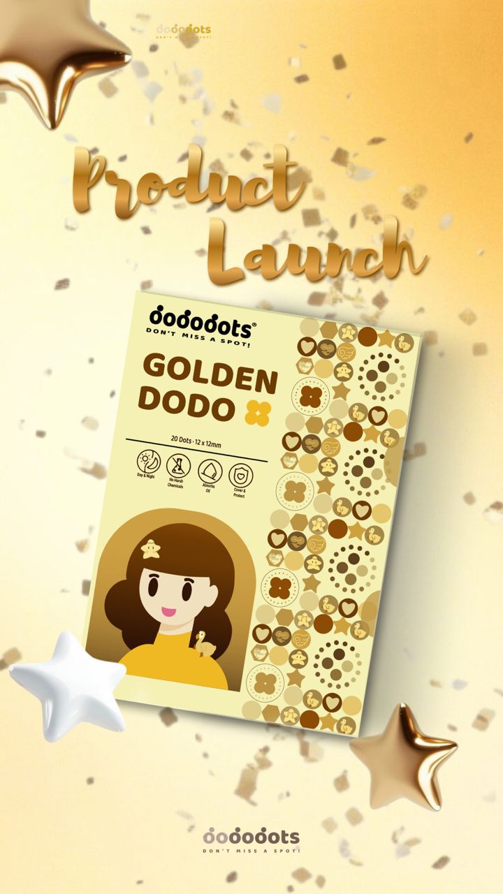
“Find the Golden Dodo” turns Dododots into a mystery-driven experience where fans search for limited-edition Golden Dodo patches through roadshows, vending machines and online hints. Blind-box excitement and premium golden rewards make the brand experience feel fun, collectible and confidence-boosting rather than clinical.

Golden Dodo product launch visual Golden Dodo packaging design
02 / INSPIRATION

A FAMILIAR REWARD MECHANIC, REIMAGINED.

The strategic inspiration came from campaigns that made a rare golden item feel worth searching for. The concept borrows the anticipation of Willy Wonka’s Golden Ticket and the collectible excitement of James Charles’ golden sponge campaign, then translates that mechanism into Dododots’ playful brand world.

REFERENCE 01

Golden Ticket

A rare reward hidden inside an everyday product turns purchase into anticipation, discovery and conversation.

REFERENCE 02

Golden Sponge

A limited golden version of a familiar product creates collectibility, social sharing and a stronger reason to participate.

03 / CONSUMER JOURNEY

DISCOVER. SEARCH. FIND. SHARE.

The campaign was designed as a connected journey rather than a single advertisement, linking social content, physical touchpoints and the reward reveal.

01 / DISCOVER

See the mystery.

Fans are introduced to the Golden Dodo through campaign content, teasers and visual clues.

02 / SEARCH

Follow the hints.

Online clues direct audiences toward roadshows, vending machines and campaign locations.

03 / FIND

Unlock the reward.

Participants search for limited-edition Golden Dodo patches hidden within the campaign experience.

04 / SHARE

Make it social.

The discovery becomes content itself, encouraging people to post, compare and extend the campaign organically.

04 / VISUAL SYSTEM

MAKING THE GOLDEN DODO FEEL COLLECTIBLE.

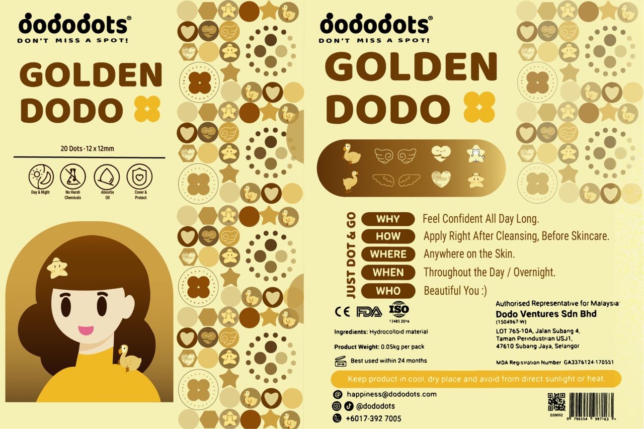
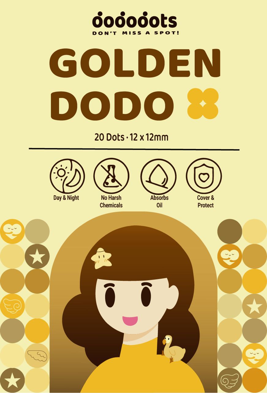
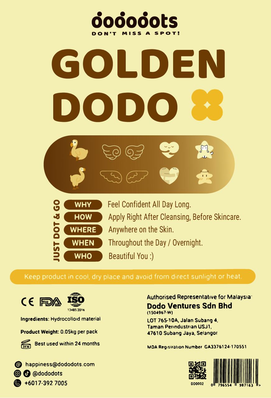
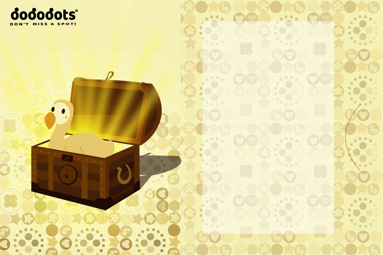
The campaign visual language expands the Dododots world through a warm gold palette, dodo character illustrations, patch icons, treasure imagery and packaging designed to make the reward feel special while still recognisably Dododots.

Golden Dodo front packaging
Golden Dodo back packaging
Golden Dodo pattern and dodo illustration
Golden Dodo campaign launch visual
05 / EXPERIENCE DESIGN

FROM CAMPAIGN IDEA TO PHYSICAL ACTIVATION.

My role extended beyond the campaign strategy. As part of the 3D Design Team, I contributed to the roadshow design so the treasure-hunt idea could become a physical experience rather than remain only on social media.

Find the Golden Dodo campaign experience visual
My Contribution

BRAND STRATEGY + 3D EXPERIENCE.

I developed the campaign concept and consumer journey, integrating social, roadshow and content activations. I also contributed to the 3D roadshow design to help bring the campaign experience to life in a physical space.

06 / CAMPAIGN FILM

THE IDEA IN MOTION.

The campaign video brings together the Golden Dodo mystery, visual language and treasure-hunt tone in motion.

×
Brand Creative

Krumble Brownies

A creative brand project focused on identity, communication and the product experience.

BrandingCreative DirectionContent
AI Storytelling · Character World

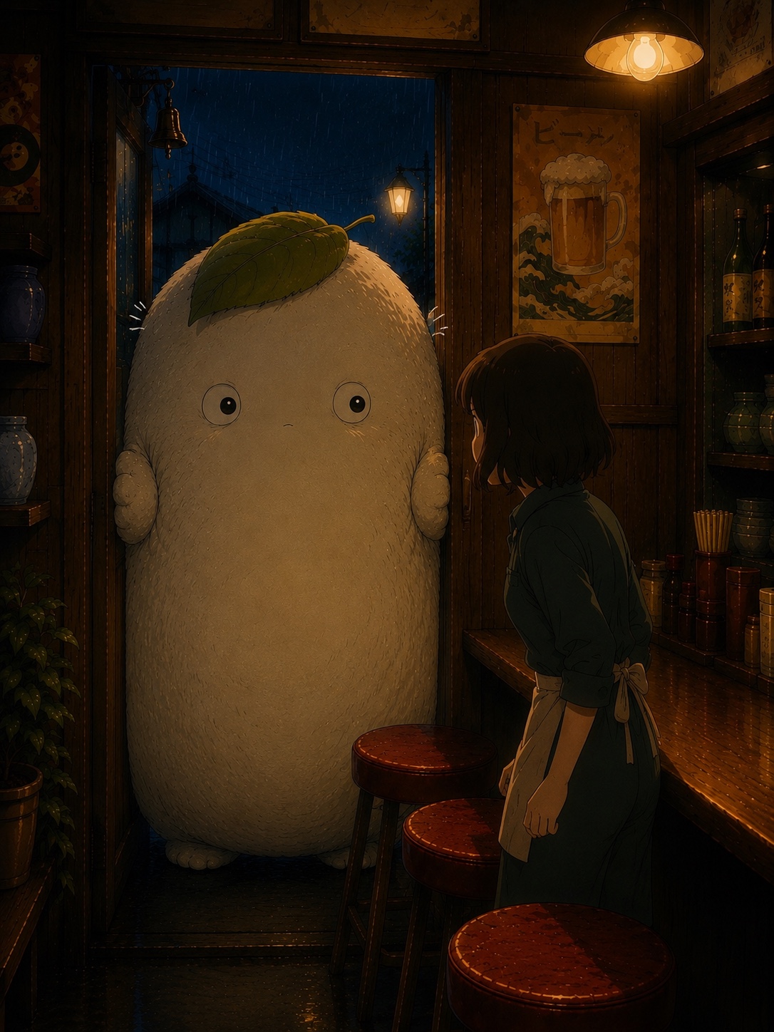
MORIA COZY FOOD STORY

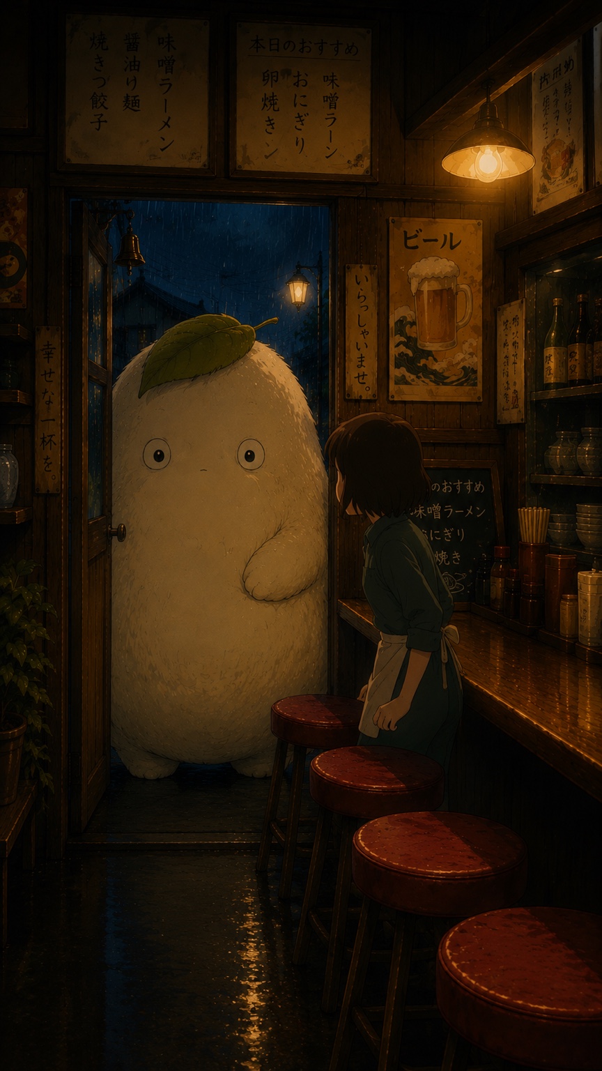
A character-led animation experiment about a quiet forest visitor, a rainy ramen shop and the small rituals that make food feel magical.

My roleCreative concept · AI art direction
FocusCharacter · Story · Motion
FormatShort-form animation
Mori arriving at a rainy ramen shop
01 / The idea

A LITTLE STORY
BUILT AROUND FOOD.

Mori began as a simple storytelling idea: create a recurring character who could enter different food worlds without needing dialogue. The mood is deliberately quiet and cinematic — rain outside, warm light inside, simple gestures and food at the centre of the story.
02 / Character development

MEET
MORI.

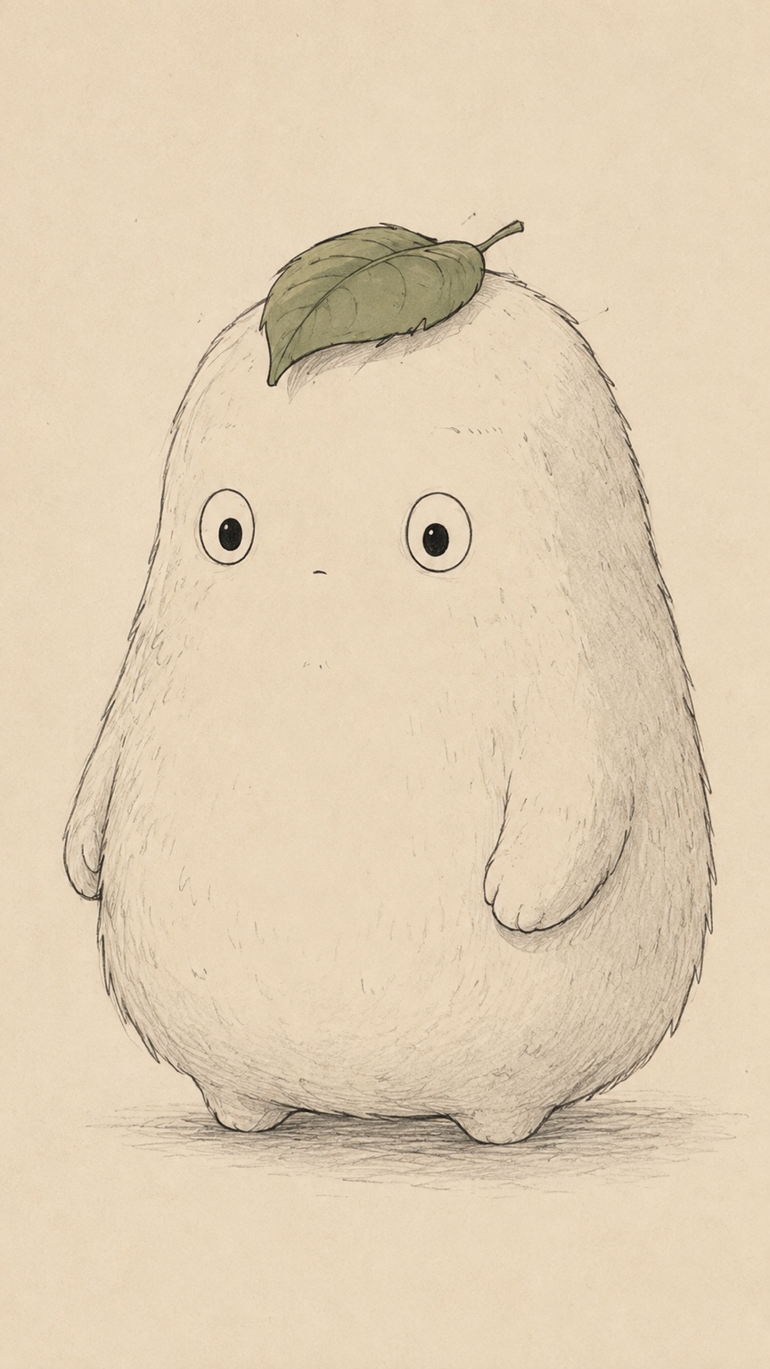
The character was designed to be instantly readable: a large cream silhouette, tiny facial features and a single leaf that becomes his visual signature. Keeping those proportions and features stable became one of the most important parts of the AI production process.

Original Mori character sketch
03 / World building

RAIN OUTSIDE.
WARMTH INSIDE.

The ramen shop establishes the visual language of the world: dark timber, amber practical lighting, wet reflections and deep blue rain. The contrast makes Mori feel strange enough to be magical, but comfortable enough to belong there.
Mori and chef inside the ramen shop
04 / Story through gesture

NO DIALOGUE
NEEDED.

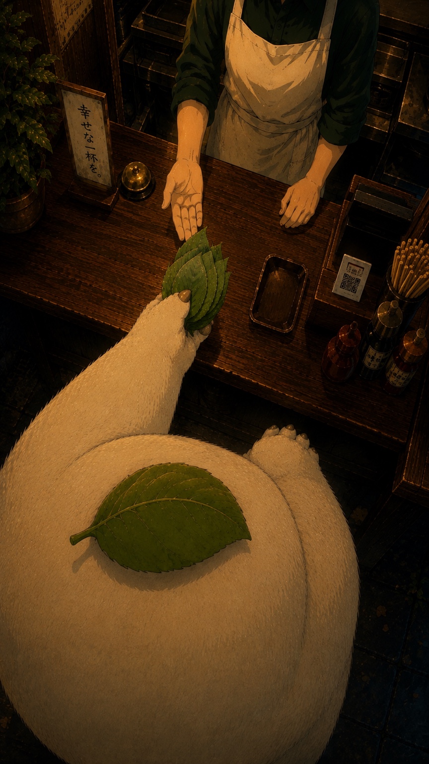
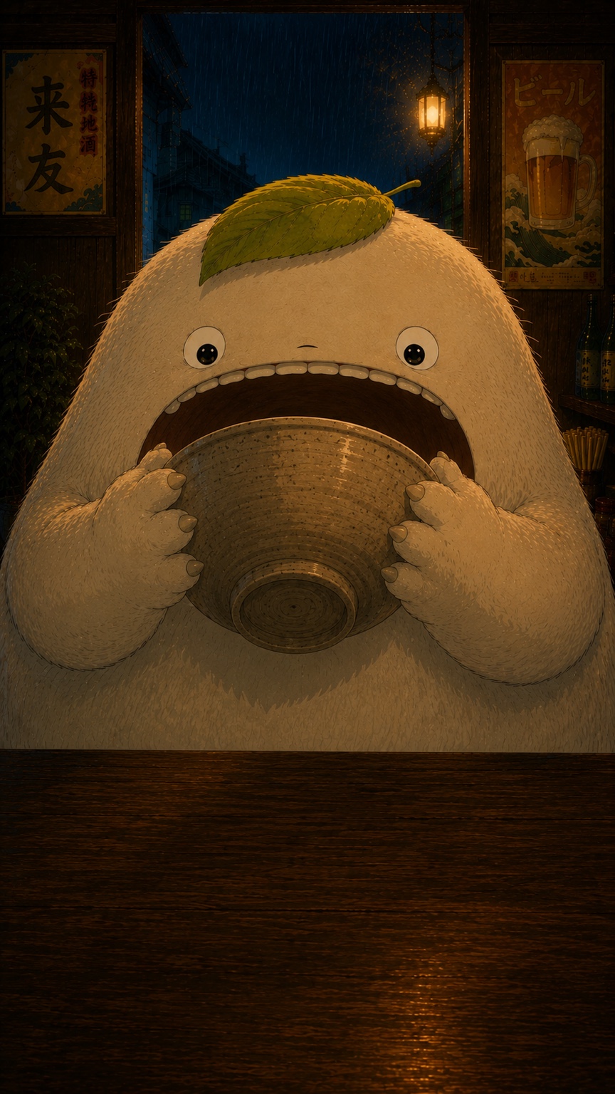
Instead of explaining everything with text, the story is communicated through actions. Mori arrives, interacts with the chef, presents the leaves, receives the food and reacts. That simplicity keeps the animation understandable even as a short-form social video.
Mori handing leaves to the chefMori finishing a bowl at the ramen shop
05 / AI production

CONSISTENCY
OVER NOVELTY.

The difficult part was not generating individual frames. It was making consecutive shots feel like the same film. Each scene had to preserve Mori’s body shape, eyes, leaf, scale, the chef, the shop layout and the final food while still allowing enough movement to feel alive.
01 · LOCKEstablish the character, environment and visual rules before animation.
02 · DIRECTUse controlled camera framing and restrained actions to reduce unwanted visual changes.
03 · REFINEReview continuity between shots and rebuild scenes when important features drift.
06 / Final animation

FROM STILL
TO MOTION.

The finished sequence brings the still world into motion while keeping the performance deliberately subtle and character-led.

“The goal wasn’t to show what AI can generate. It was to see whether I could direct it into a world that feels consistent.”

Mori · AI storytelling experiment
PRODUCT CONCEPT · AI VISUALISATION

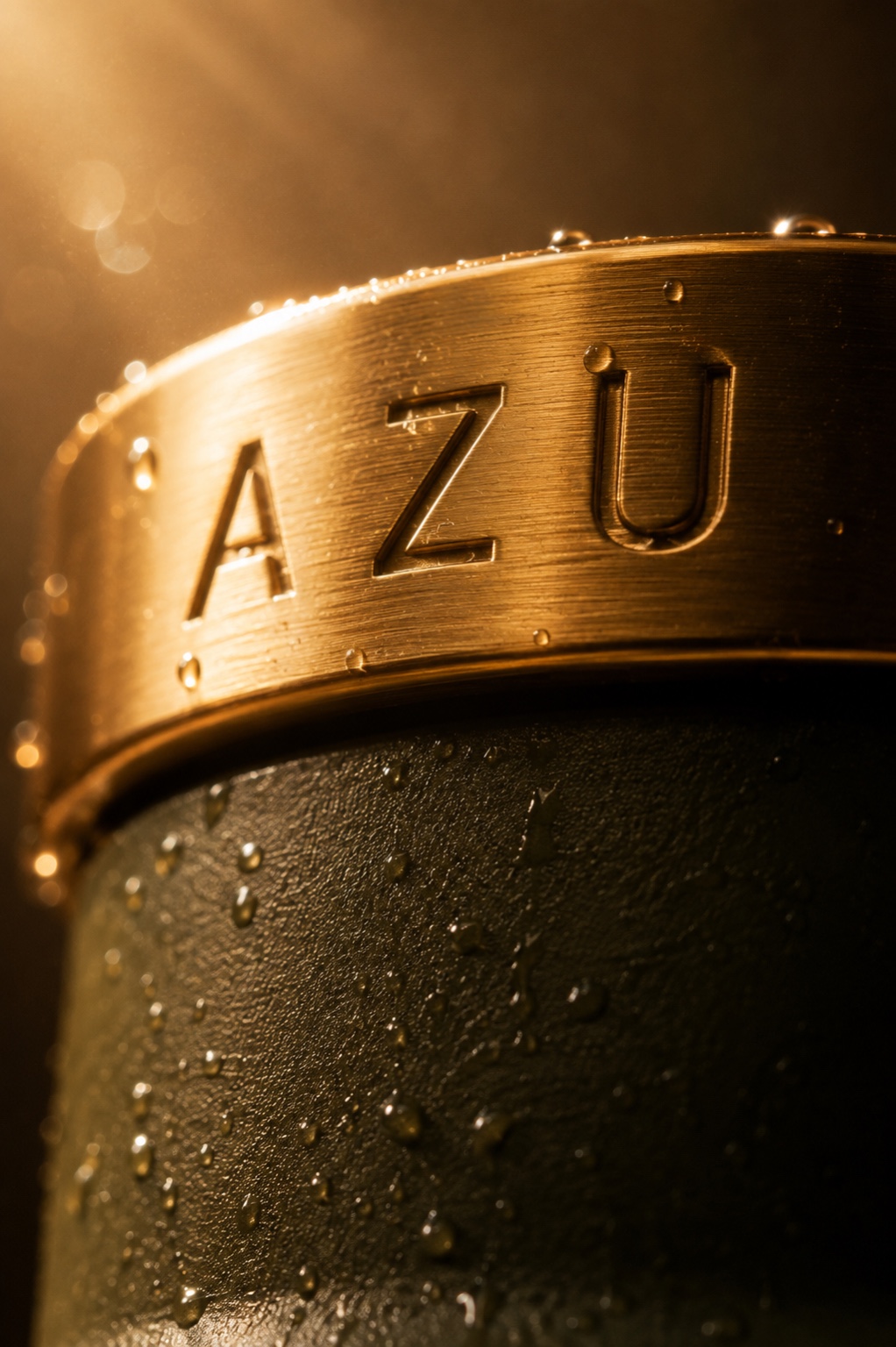
AZUROOTED IN CULTURE. MADE FOR MOVEMENT.

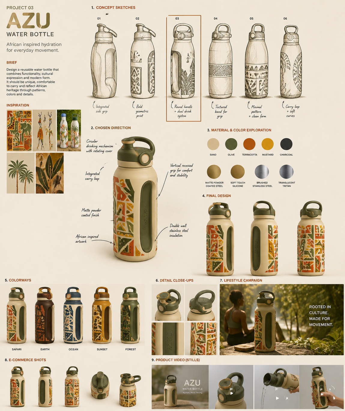
A self-initiated reusable water bottle concept developed from product thinking into a complete visual world — combining an earthy material language, African-inspired geometric detailing, premium lifestyle imagery and cinematic AI motion.

Project TypeProduct Concept
FocusDesign · Visualisation · Motion
RoleConcept · Art Direction · AI Visualisation
AZU bottle cinematic hero
01 / DEVELOPMENT

FROM IDEA TO PRODUCT SYSTEM.

The project explores more than a single product render. The bottle was developed through form, materials, colour, functional details, pattern language, e-commerce views, lifestyle direction and motion studies.

AZU product development board
02 / DESIGN LANGUAGE

EARTHY. TACTILE. DISTINCTIVE.

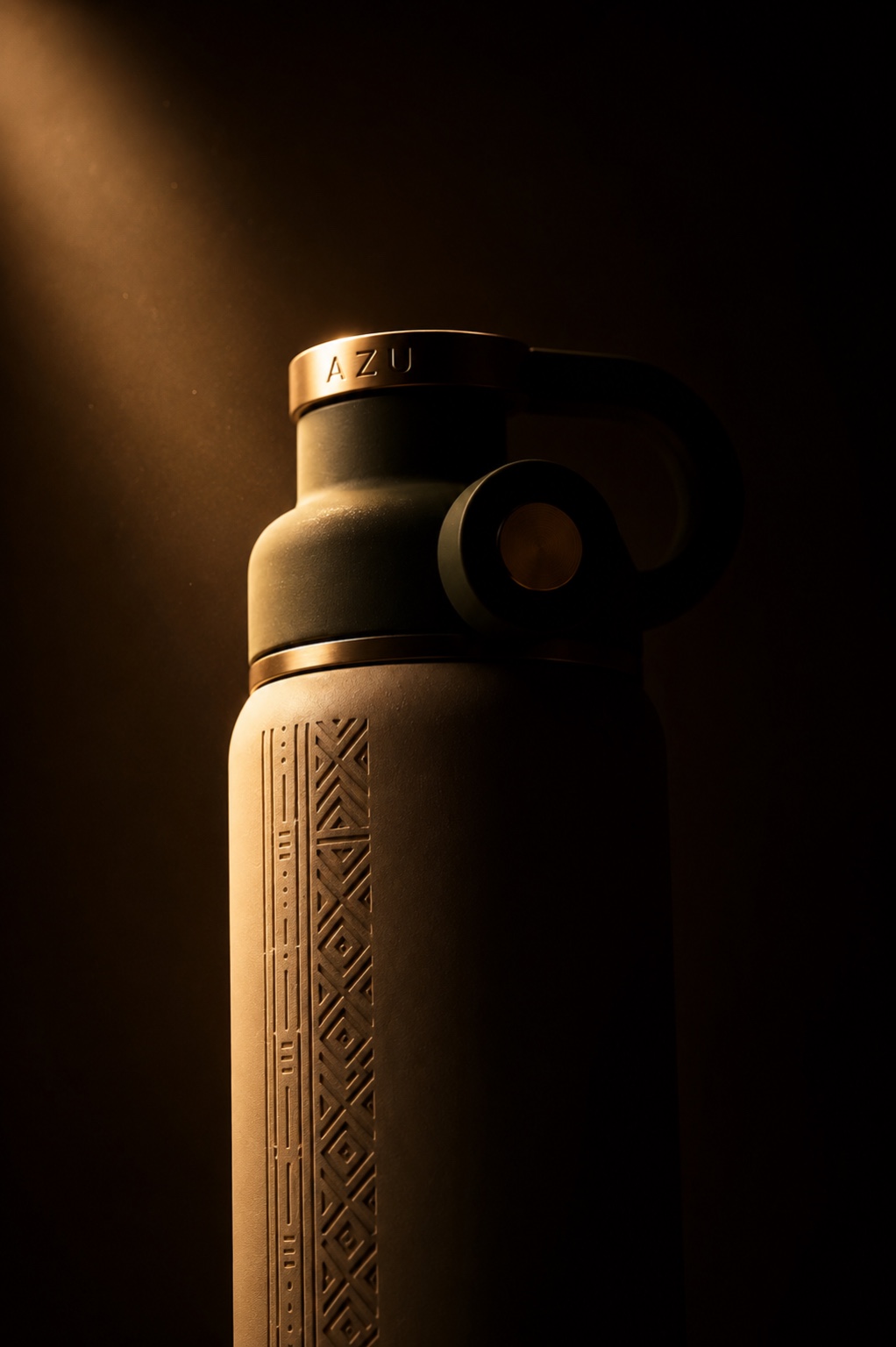
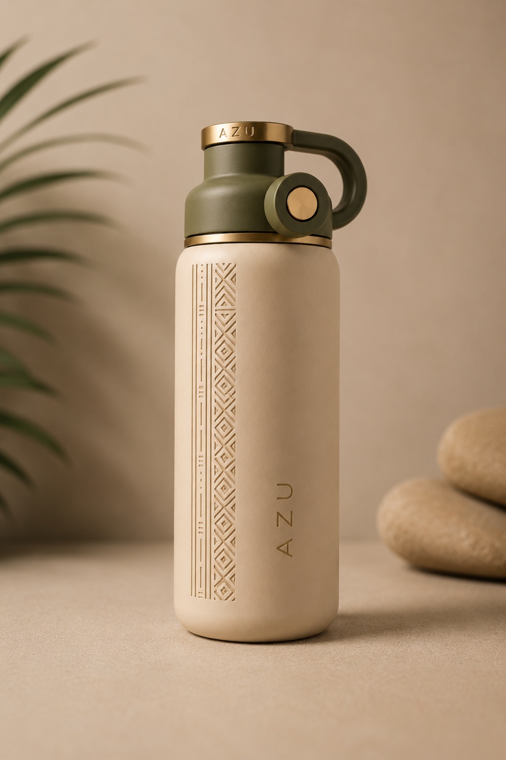
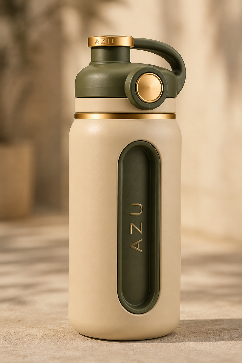
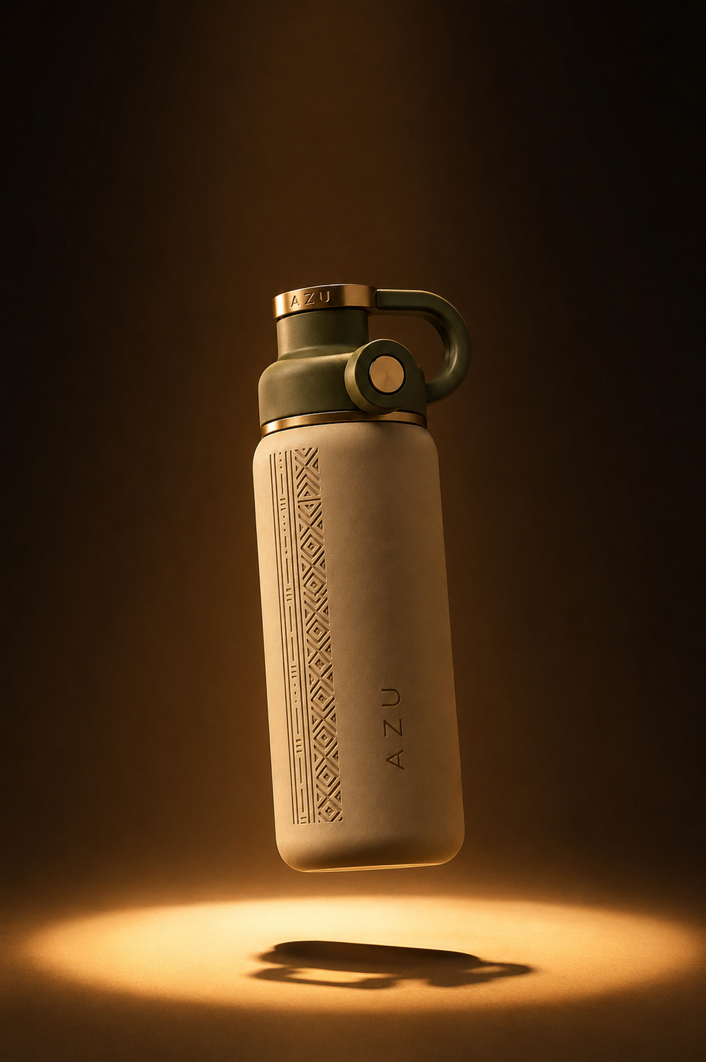
The visual system combines a matte sand-beige body, olive-green functional components and brushed-gold accents with a vertical African-inspired geometric engraving. The intention was to make the cultural influence feel integrated into the product rather than added as decoration.

AZU studio product view
AZU product detail
03 / LIFESTYLE

DESIGNED TO MOVE WITH YOU.

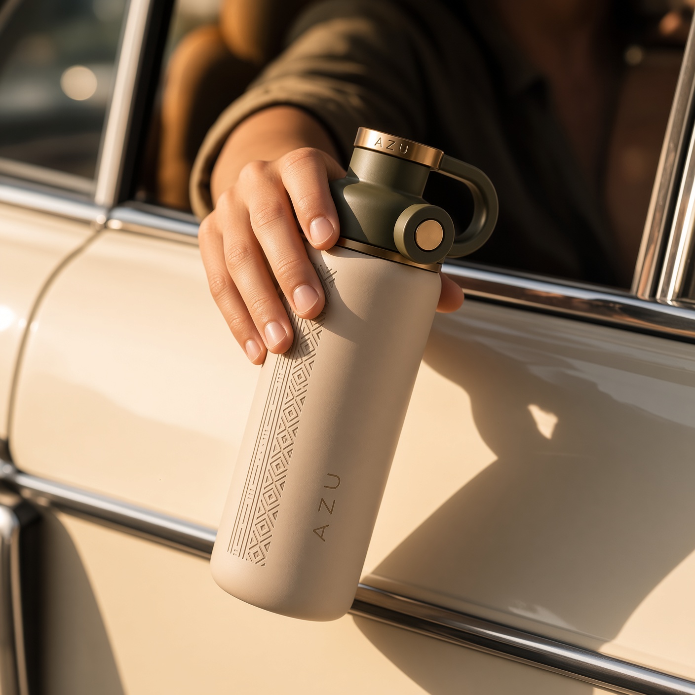
Moving the bottle out of the studio helped test whether the design could still feel premium in a real-world context. The lifestyle direction keeps the palette warm and understated while making the product the visual focus.

AZU bottle lifestyle car scene
AZU floating product visual
04 / CINEMATIC WORLD

LIGHT, WATER & MATERIAL.

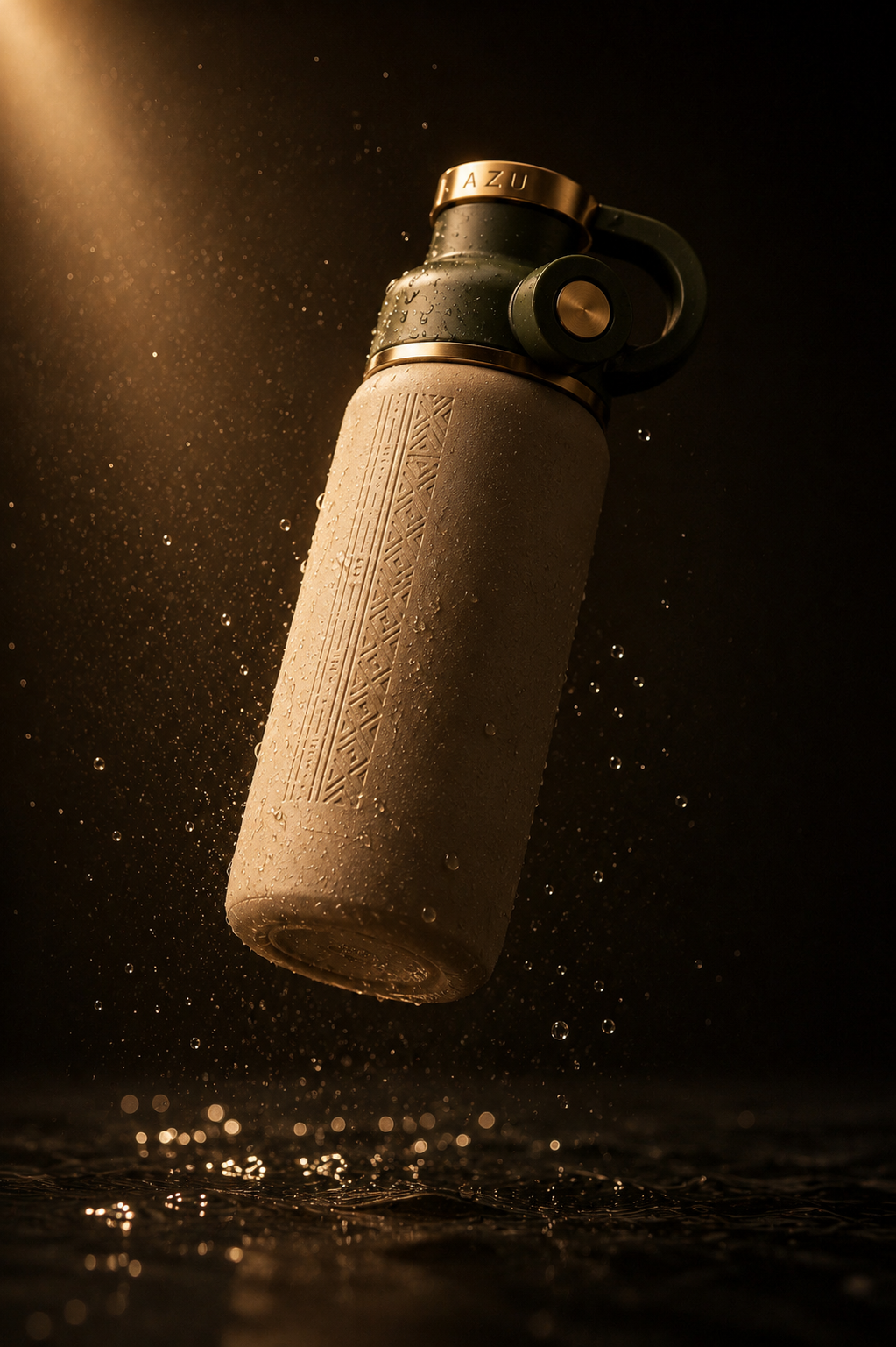
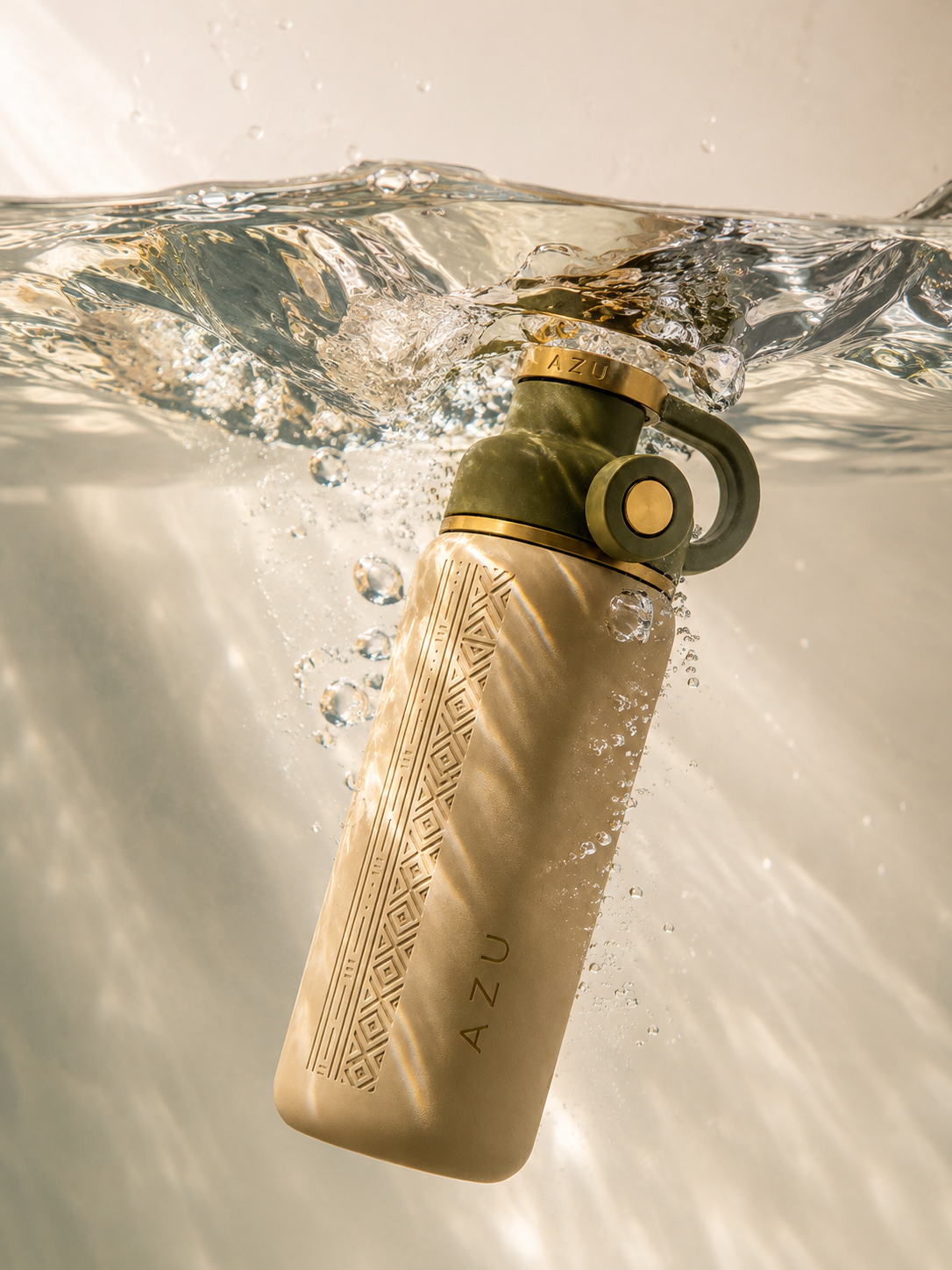
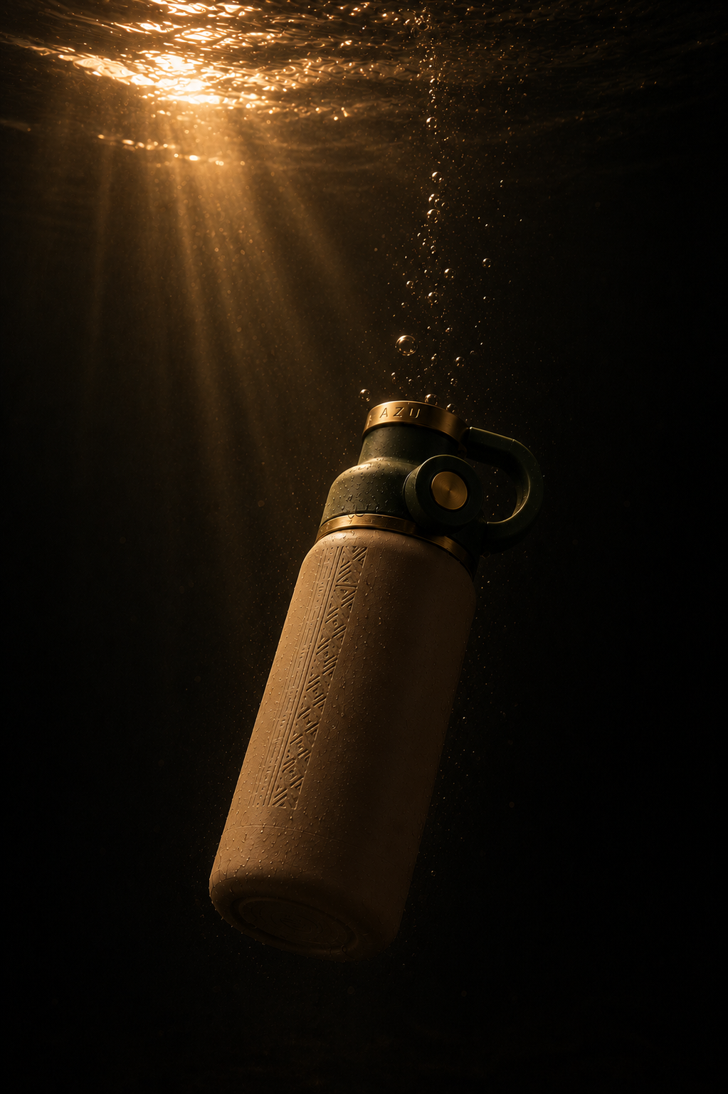
The campaign studies push the same bottle into more cinematic environments. Warm directional light, water, droplets and underwater depth are used to emphasise the matte body, engraved strip and metallic details without changing the core product design.

AZU bottle with water droplets
AZU bottle beneath sunlit water
AZU underwater cinematic visual
AZU gold light detail
05 / MOTION

TAKING THE PRODUCT INTO FILM.

The still-image direction was translated into short AI product films. The focus was controlled camera movement, realistic water behaviour, material consistency and keeping the AZU bottle recognisable from frame to frame.

AZU · Cinematic product film 01
AZU · Cinematic product film 02

MY
ROLE.

I developed the product concept and directed the visual system across form, material choices, cultural pattern integration, product imagery, lifestyle art direction and AI-assisted motion.

Product ConceptCreative DirectionAI Art DirectionProduct VisualisationMotion Direction
02 / CONSISTENCY

DIRECTING AI LIKE A CAMPAIGN.

The challenge was not simply generating a polished image. It was maintaining a consistent product identity — bottle shape, amber material, dark dropper, label hierarchy and premium mood — so the result feels intentionally art-directed rather than randomly generated.

03 / MY ROLE

CREATIVE DIRECTION THROUGH AI.

I developed the visual concept and directed the composition, lighting, material treatment and commercial mood, using AI as the production tool while keeping the creative decisions and final art direction controlled.

← AI Creative Lab Next project · AZU →
← Back to Work
ZM® / PORSCHE 911
Close ×
EDITORIAL POSTER DESIGN · ADOBE PHOTOSHOP

PORSCHE
911.

A self-initiated visual design study exploring how automotive performance can be translated into a clean, fashion-forward editorial composition.

Project TypeEditorial Poster
SoftwareAdobe Photoshop
FocusComposition · Image Treatment · Motion
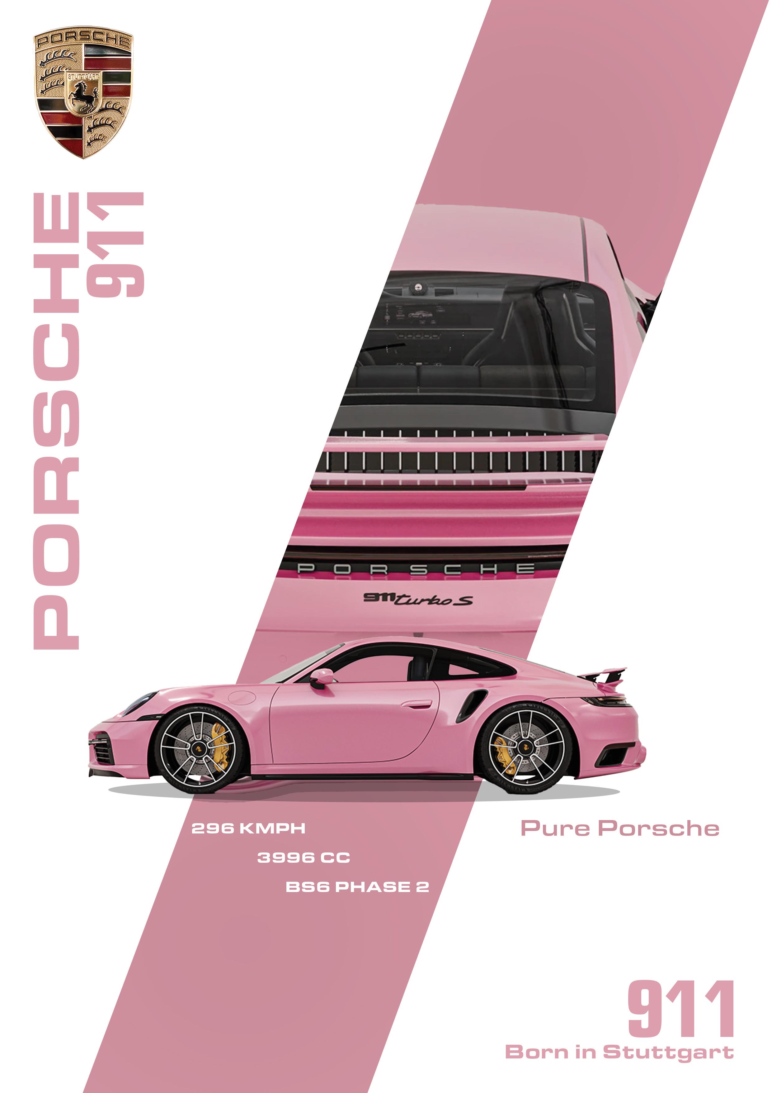
Porsche 911 Turbo S editorial poster
01 / CONCEPT

PERFORMANCE, REFRAMED.

Rather than using the dark, aggressive visual language often associated with performance cars, I explored a softer and more editorial direction. The pink palette creates contrast against the technical nature of the Porsche 911 Turbo S, giving the poster a more distinctive and contemporary personality.

01

Visual Direction

Developed a clean editorial look around white space, blush pink and sharp geometric framing.

02

Image Selection

Combined a hero side profile with a tightly cropped rear-detail image to communicate both form and performance.

03

Hierarchy

Used oversized vertical typography, technical specifications and directional shapes to guide the eye through the composition.

04

Finishing

Balanced colour, masking, scale and spacing in Photoshop to create one cohesive automotive editorial piece.

Full Porsche 911 Turbo S poster
Design System

ONE CAR. MULTIPLE VISUAL LAYERS.

The composition combines product photography, technical information and large-scale typography without allowing any one element to overpower the car itself. The diagonal pink structure gives the layout movement, while the restrained palette keeps the overall piece refined.

Adobe PhotoshopCompositingMaskingTypographyColour TreatmentVisual Hierarchy
02 / MOTION

EXTENDING THE POSTER INTO MOTION.

The static artwork was extended into a short motion piece, allowing the same visual language to move beyond a single poster while keeping the original composition and automotive focus intact.

Porsche 911 Turbo S · Motion Extension

MY
ROLE.

I handled the full visual execution of this self-initiated project, from composition and image selection through masking, colour treatment, typography and final motion presentation.

Editorial Design Art Direction Photo Manipulation Motion Presentation
← Back to AI Lab
ZM® / MEDICUBE
Close ×
AI COMMERCIAL · PRODUCT VISUALISATION

MEDICUBE.

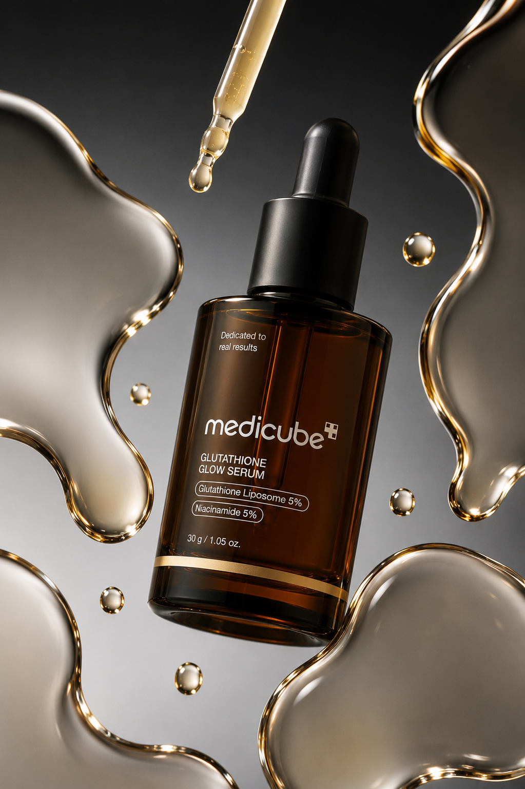
A self-initiated skincare visual study exploring premium product art direction through warm lighting, glossy serum textures and controlled AI-assisted imagery.

Project TypeAI Commercial Study
CategoryBeauty · Skincare
RoleCreative Direction · AI Art Direction
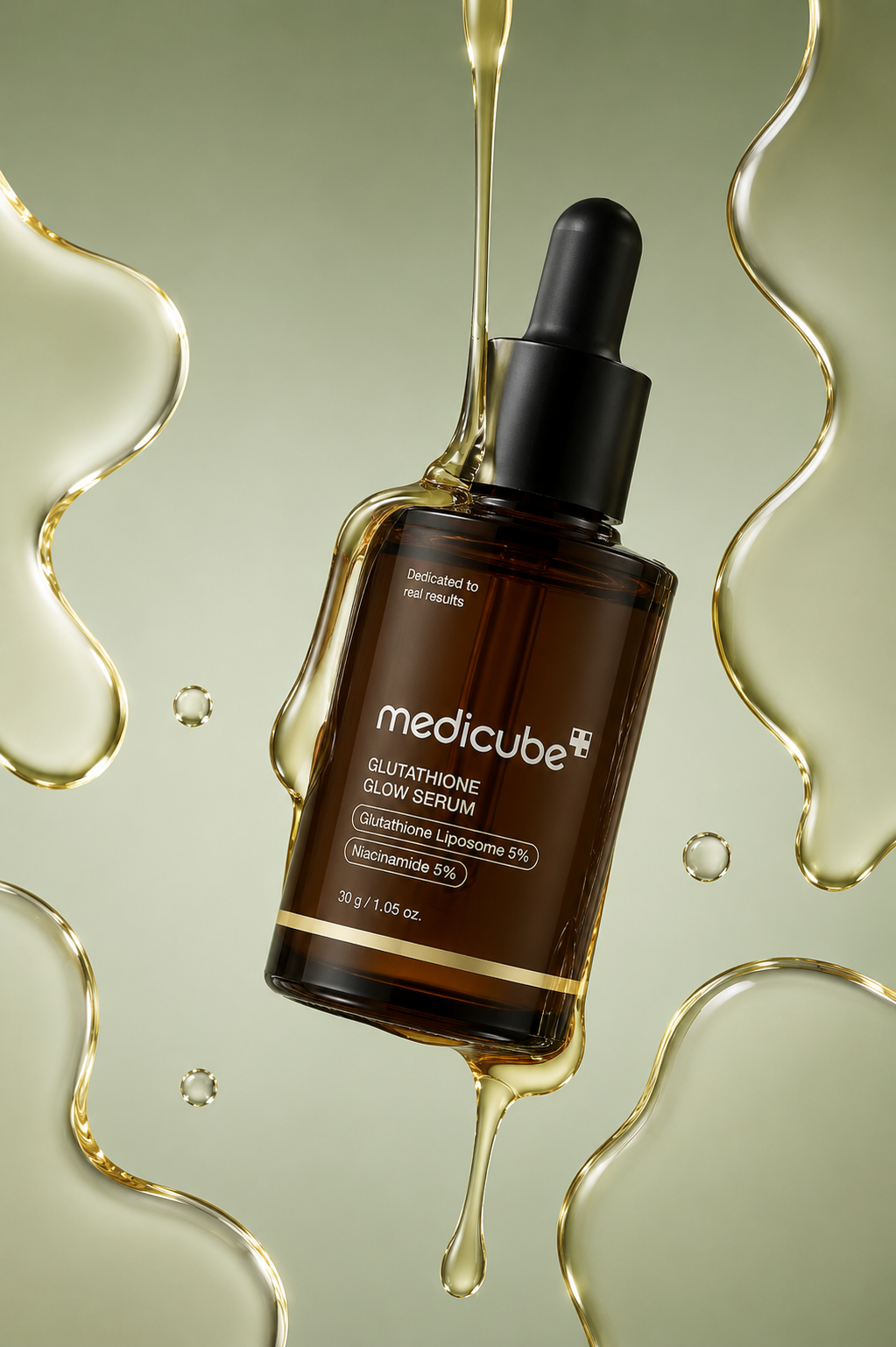
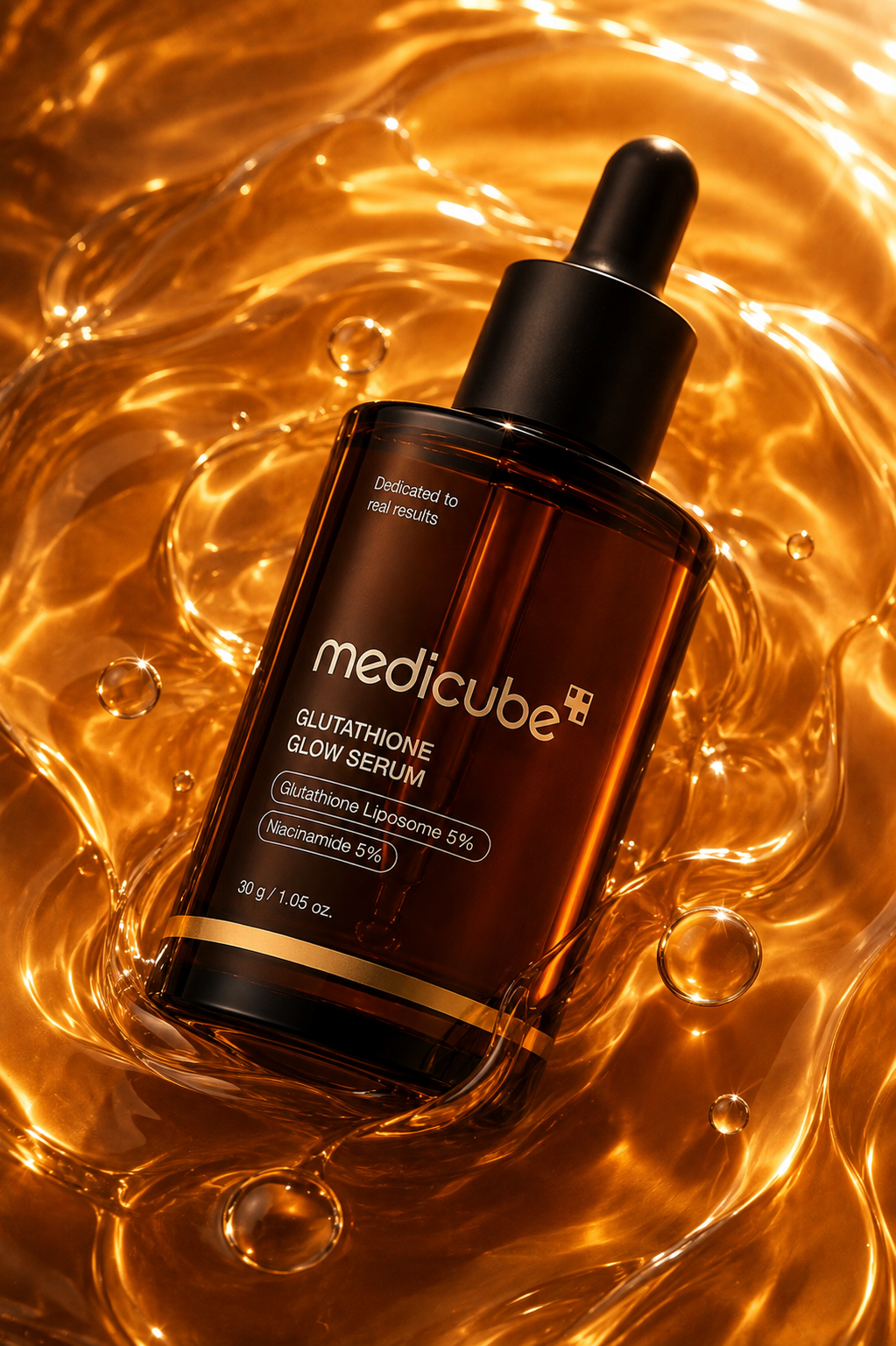
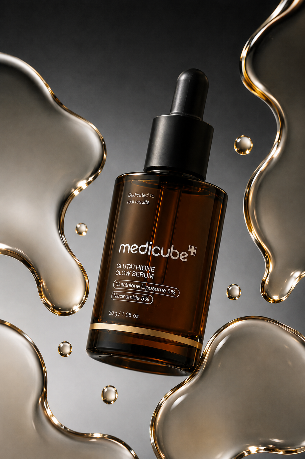
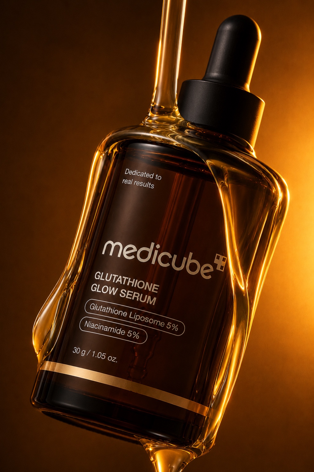
Medicube Glutathione Glow Serum in golden flow
01 / VISUAL DIRECTION

A WARMER TAKE ON SKINCARE.

The visual language moves away from a purely clinical skincare aesthetic and instead uses amber glass, golden light and liquid textures to make the product feel luminous, tactile and premium.

02 / CAMPAIGN EXPLORATION

ONE PRODUCT, MULTIPLE CAMPAIGN MOMENTS.

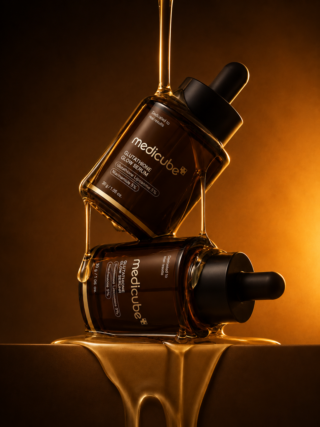
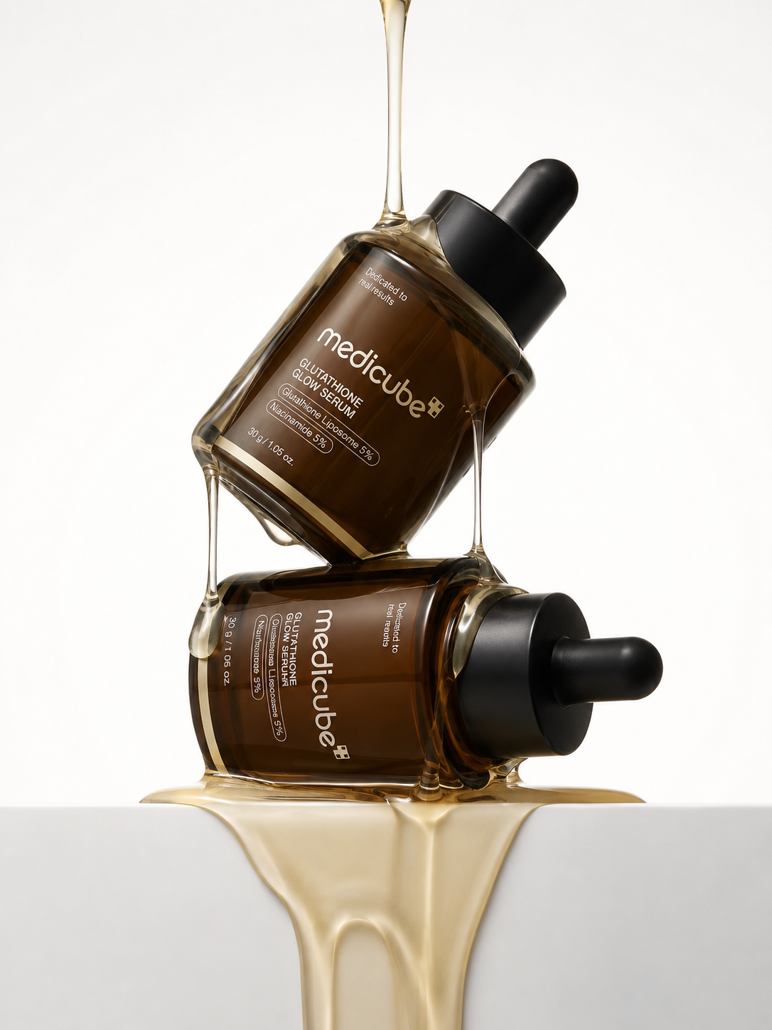
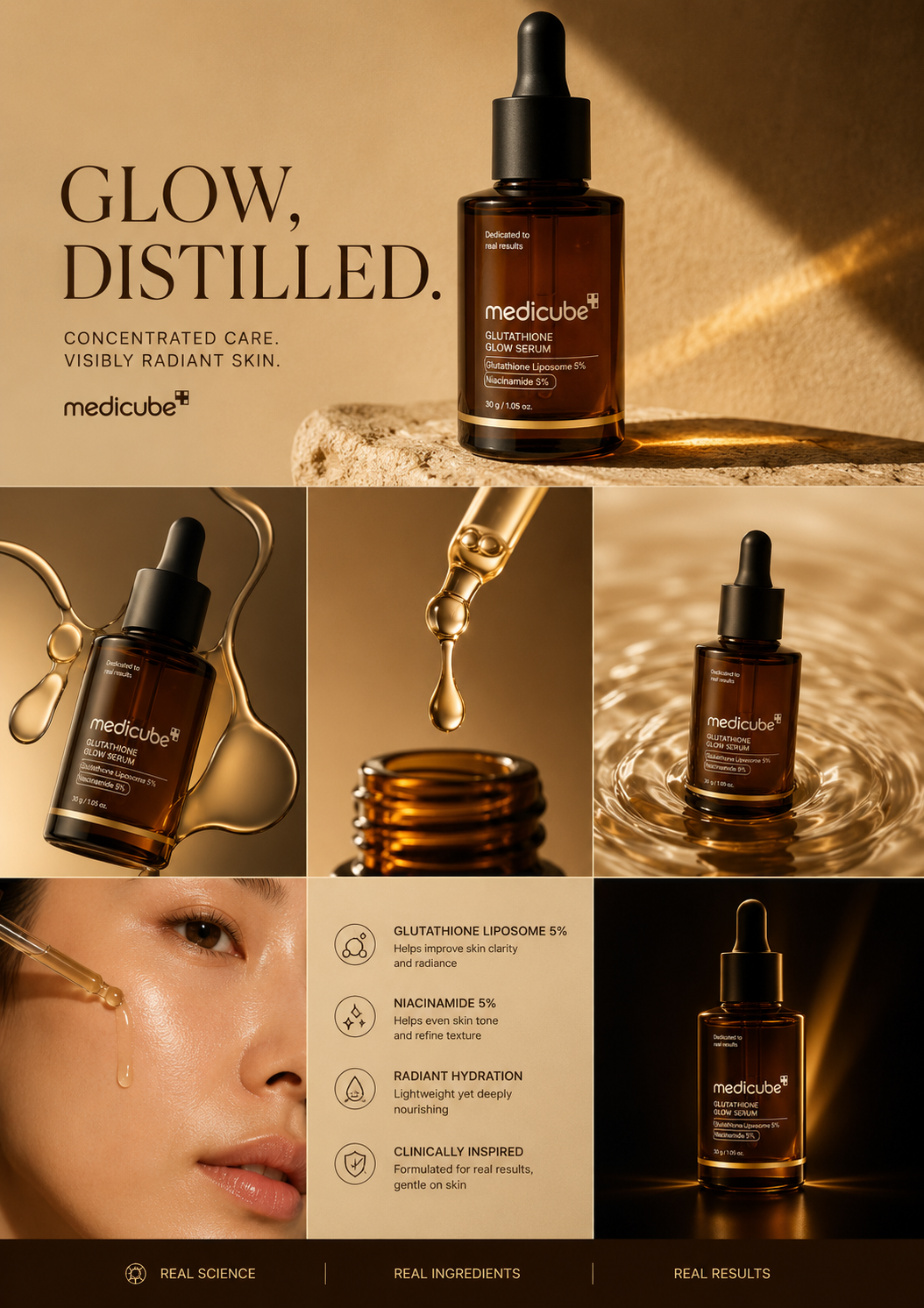
I explored how the same product could live across hero advertising, editorial layouts and more expressive beauty imagery while maintaining the warm amber-and-gold campaign world.

Medicube golden glow editorial advertisement Medicube golden glow serum advertisement
03 / PRODUCT FIDELITY

CONSISTENCY ACROSS EVERY VIEW.

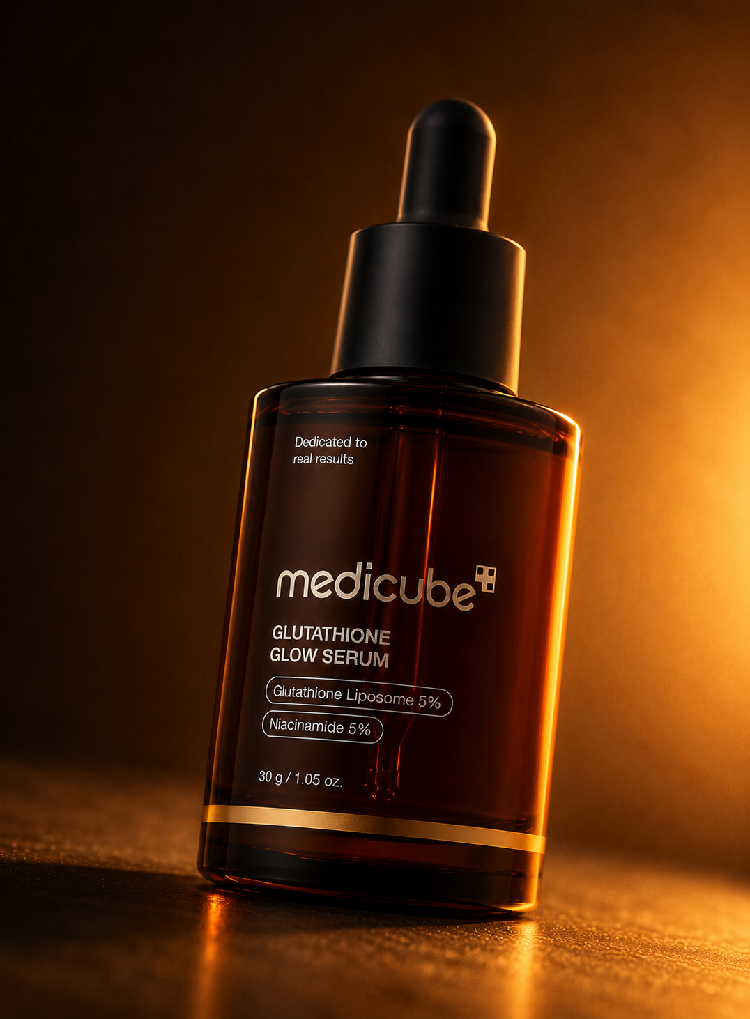
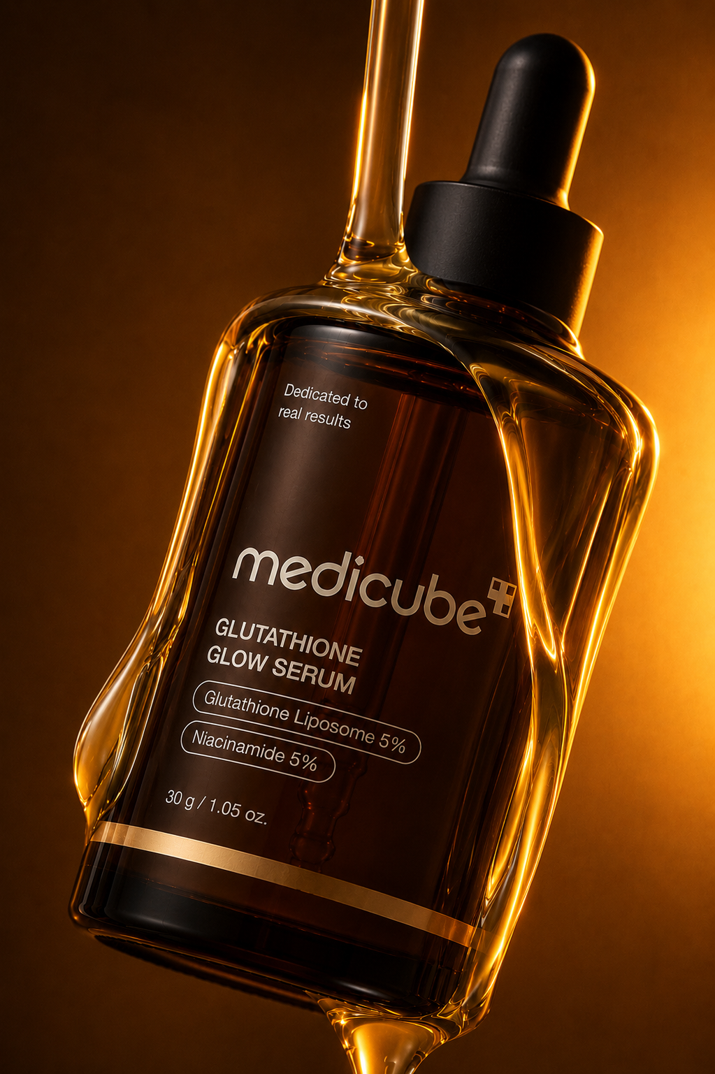
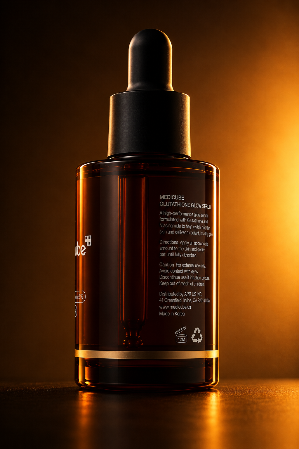
A key challenge was maintaining the bottle structure, label hierarchy, amber glass, dark dropper and premium material treatment across different angles and visual environments.

Medicube serum amber bottle back view Medicube serum in glossy liquid forms Medicube serum motion-inspired still
04 / MOTION

EXTENDING THE CAMPAIGN INTO VIDEO.

The still-image direction was translated into motion with controlled lighting, a premium product reveal and restrained movement designed to keep the serum bottle as the visual focus.

Medicube · AI Product Motion Study
05 / MY ROLE

CREATIVE DIRECTION THROUGH AI.

I developed the visual concept and directed the composition, lighting, material treatment, product consistency and commercial mood. AI was used as the production tool, while the creative decisions and final art direction were intentionally controlled across the image and motion outputs.

Medicube campaign hero visual
← Back to Work ×
Brand Strategy · Identity · Social Content

KRUMBLEBROWNIES.

A playful brownie brand built around indulgence, personality and a visual language designed to make every touchpoint feel like part of the treat.

RoleBrand Manager · Designer
FocusStrategy · Identity · Social Media
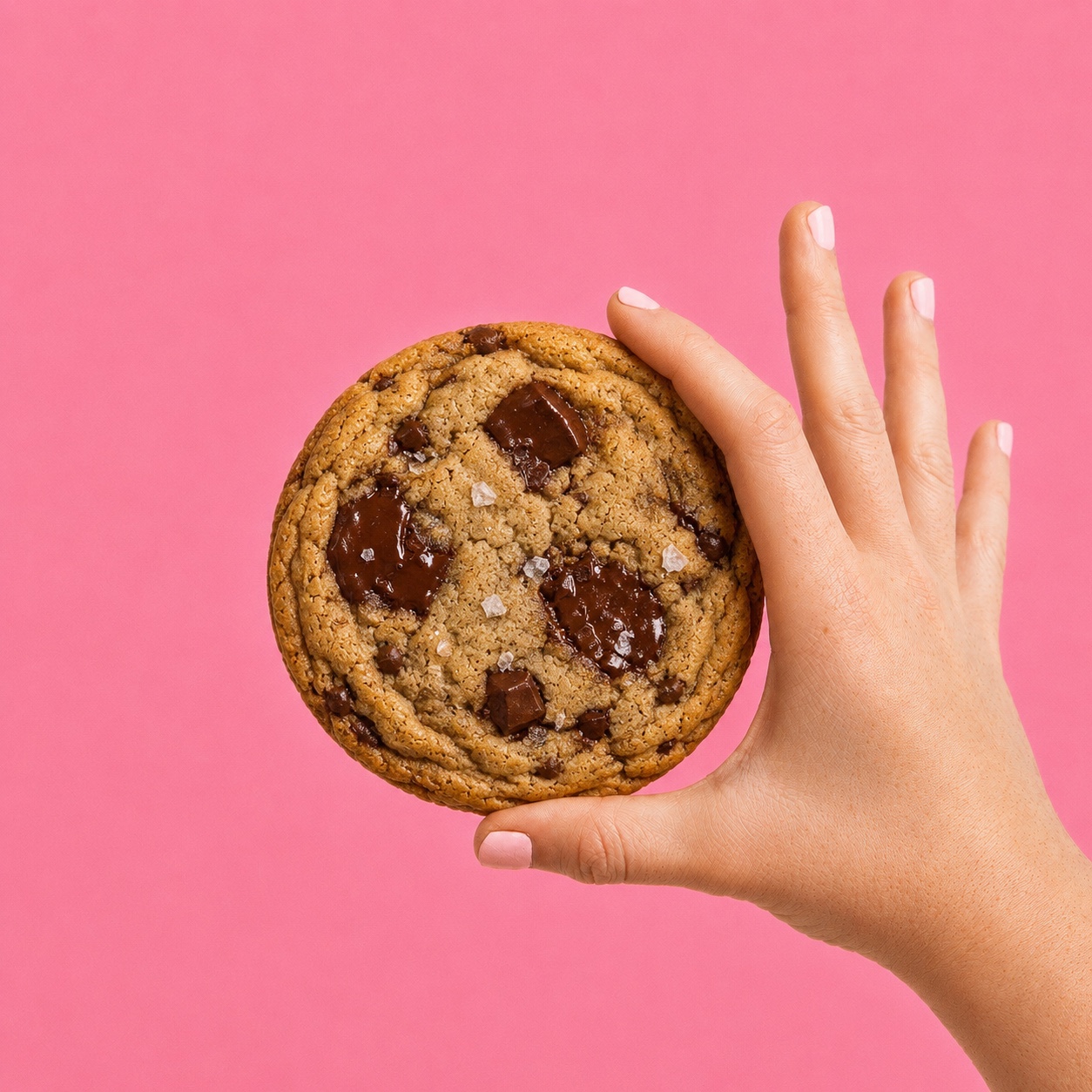
Original Krumble cookie visual supplied by Zengani
01 / The Direction

PLAYFUL. WARM. INDULGENT.

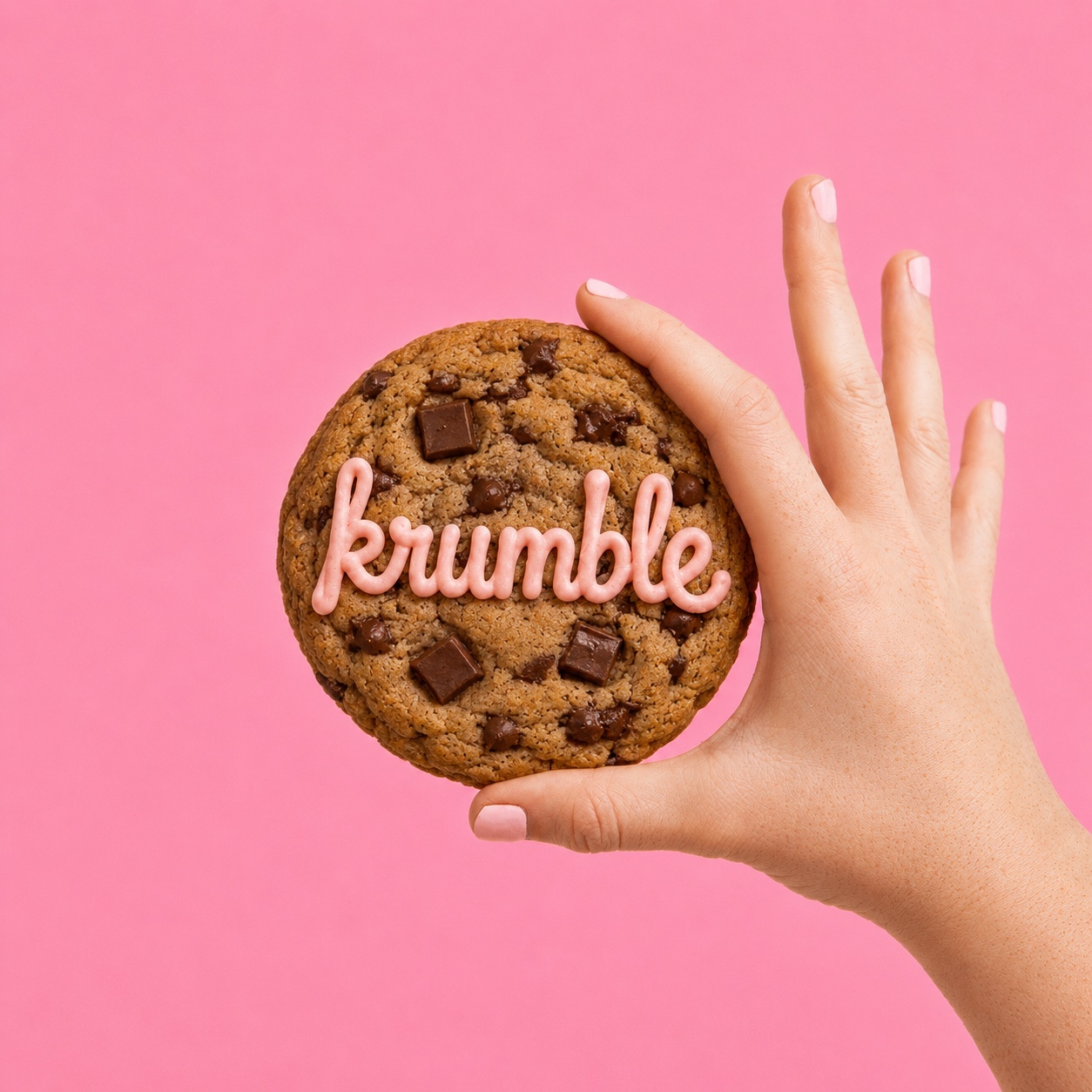
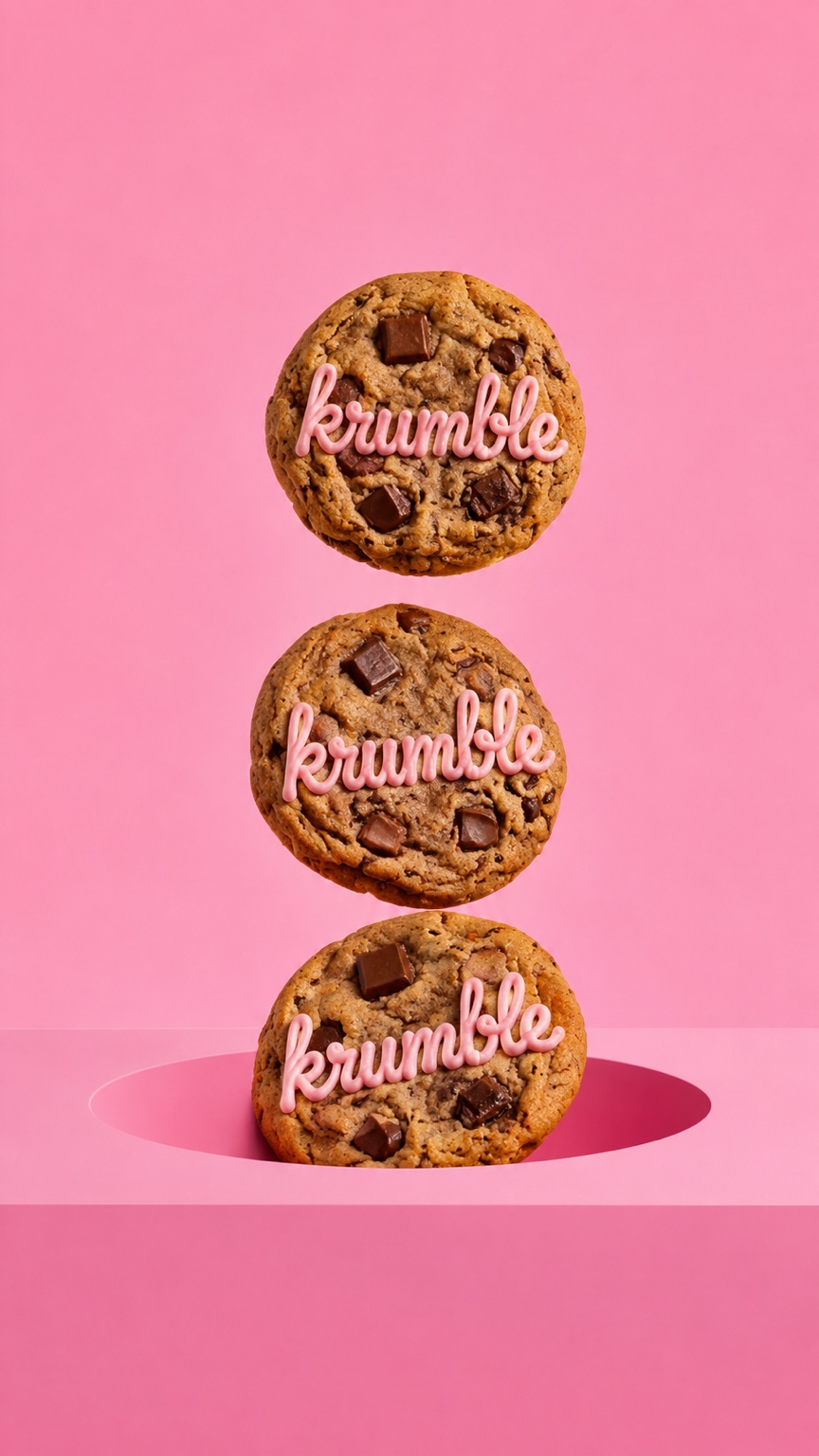
The direction turns Krumble into more than a brownie product. Soft pinks, handwritten details, cheeky copy and tactile food imagery create a brand personality that feels fun, expressive and easy to recognise.

Original stacked Krumble cookie visual
Original Krumble packaging visual

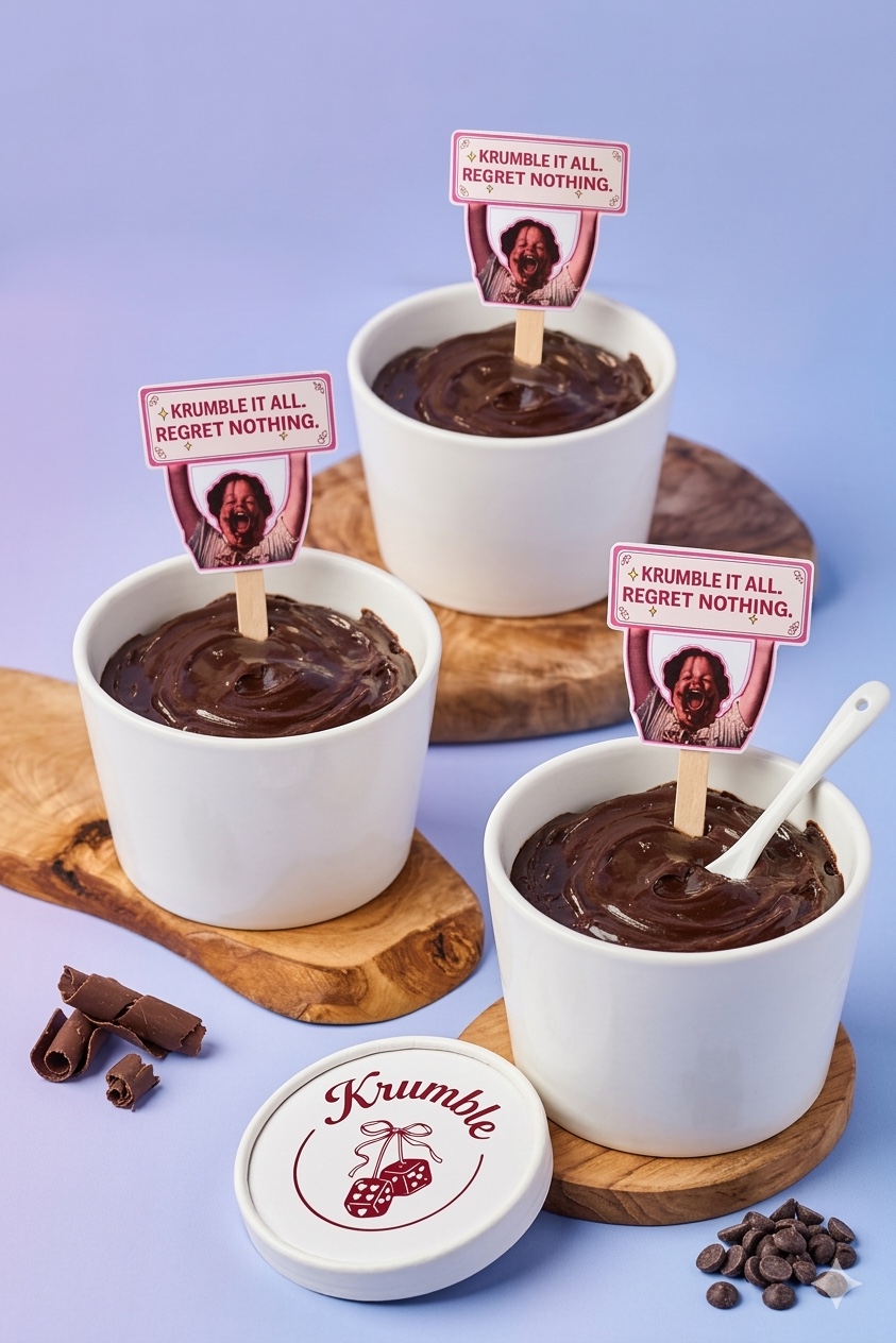
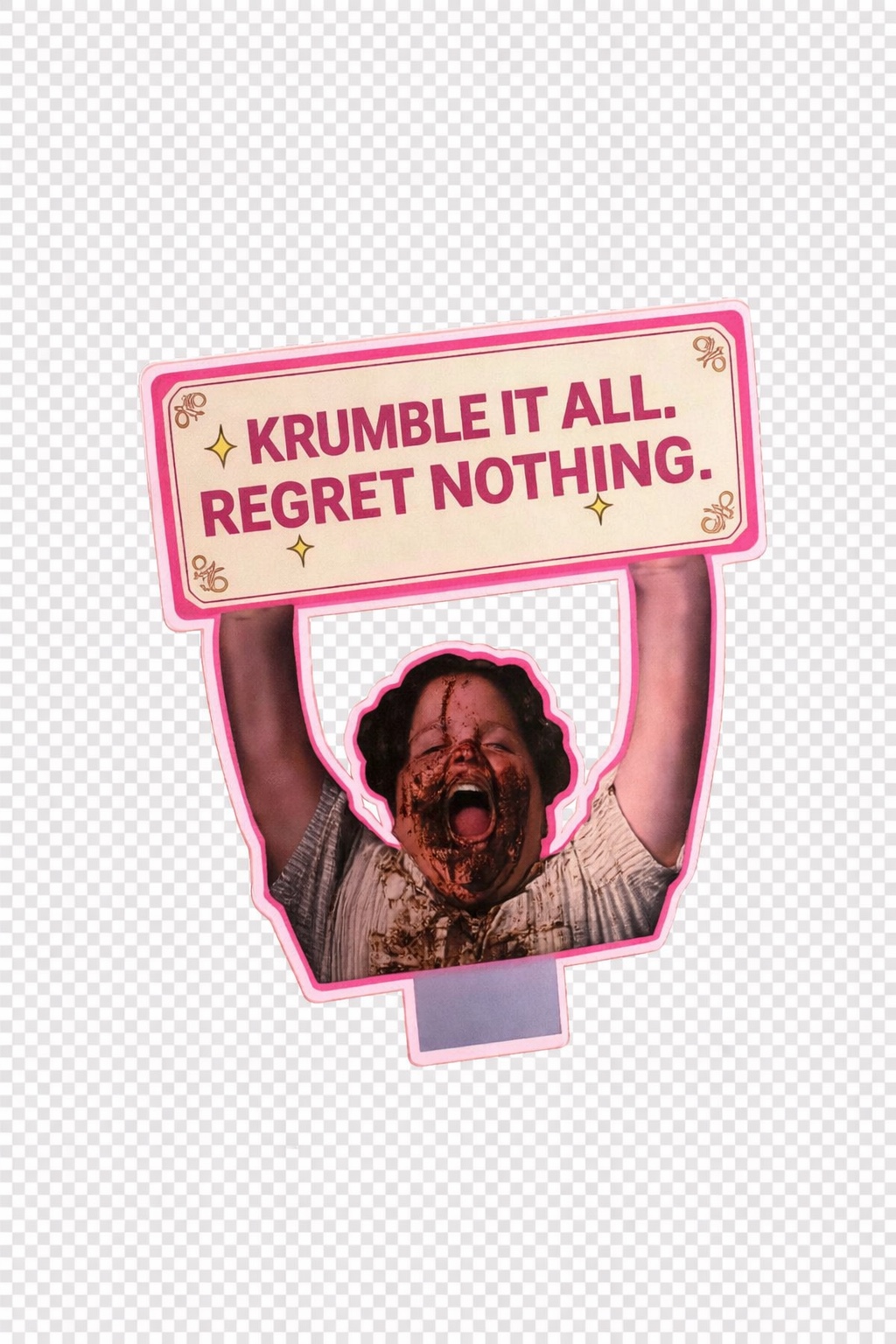
KRUMBLE IT ALL.
REGRET NOTHING.

A cheeky attitude that celebrates the messy, satisfying side of treating yourself.

02 / Packaging

THE BRAND IN YOUR HAND.

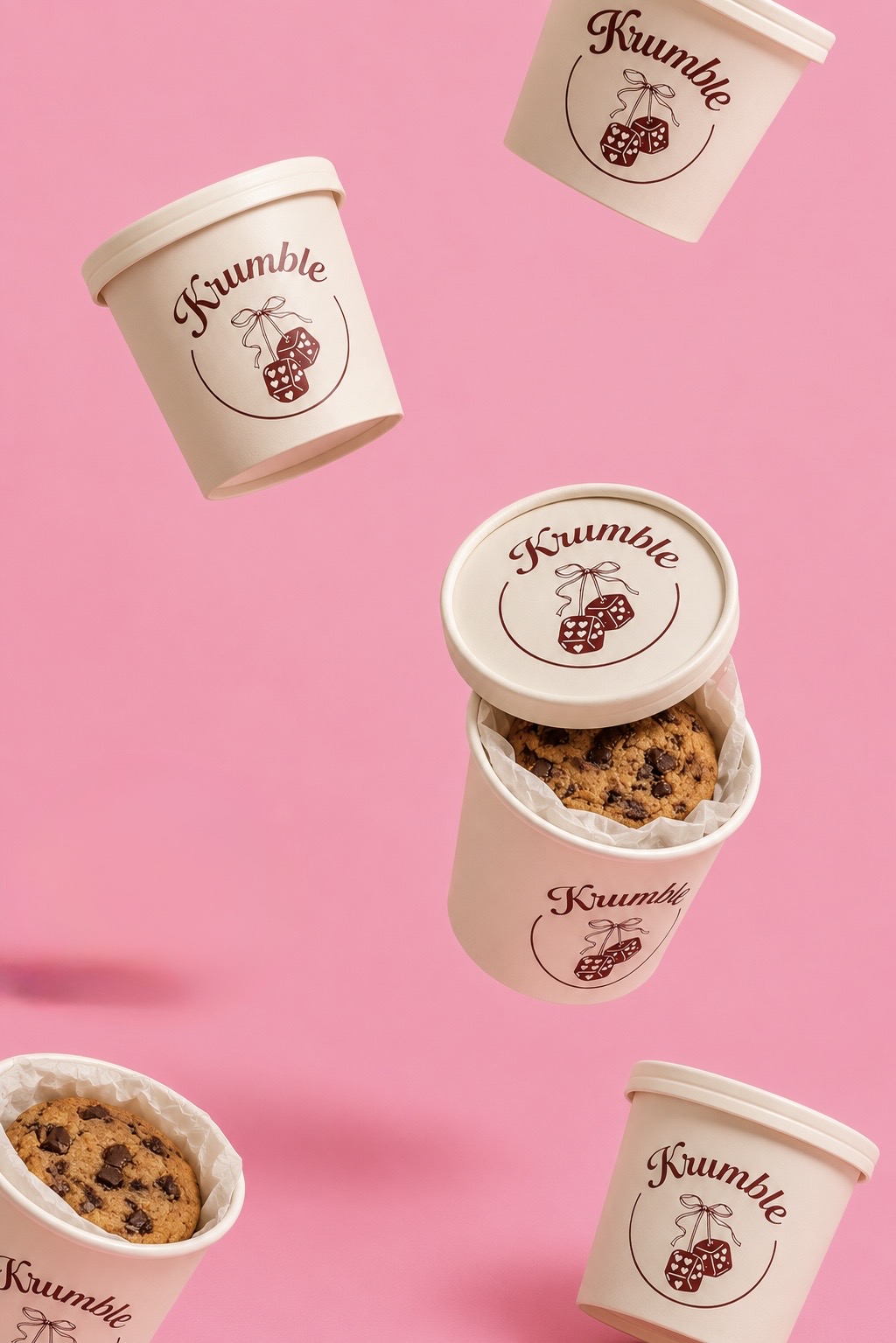
Packaging carries the same playful personality into the physical product, using the Krumble mark, soft colour palette and simple graphic language to make each container feel unmistakably part of the brand.

Original floating Krumble containers
Original Krumble brownie cups with campaign signs
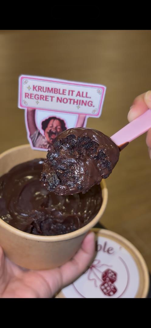
Original Krumble brownie spoon visual
03 / Content

BUILT TO STOP THE SCROLL.

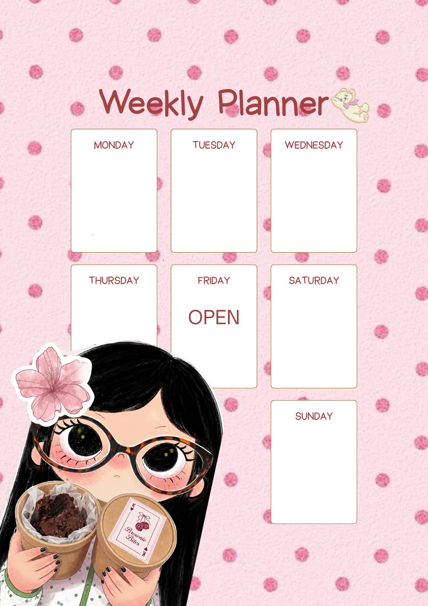
The social content mixes product close-ups, playful planning graphics, branded props and expressive food moments. The aim is to make the feed feel like an extension of Krumble’s personality rather than a catalogue of products.

Original Krumble cookie held against pink background
Original Krumble weekly planner social design
Original Krumble brownie content visual
04 / Brand Moment

TURNING A BROWNIE INTO AN ATTITUDE.

Campaign signs and character-led moments give the brand a voice beyond the logo. They introduce humour and make Krumble feel like something people can interact with, photograph and share.

Original Krumble cups with campaign signs
Original Krumble campaign sign asset
05 / Visual System

A BRAND THAT CAN FLEX.

The system was designed to move between product photography, packaging, promotional content and social posts while still feeling consistently Krumble.

Original branded cookie visual
Original packaging visual
Original weekly planner social visual
Original product content visual

MY ROLE.

As Brand Manager & Designer, I contributed to the brand strategy, developed the logo and supporting visual elements, and helped shape Krumble’s social media presence and content direction.

← Back to Selected Work