A playful dessert identity built around indulgence, personality and content people can instantly recognise.
Brand IdentityPackagingContentVisual Direction
Creative thought
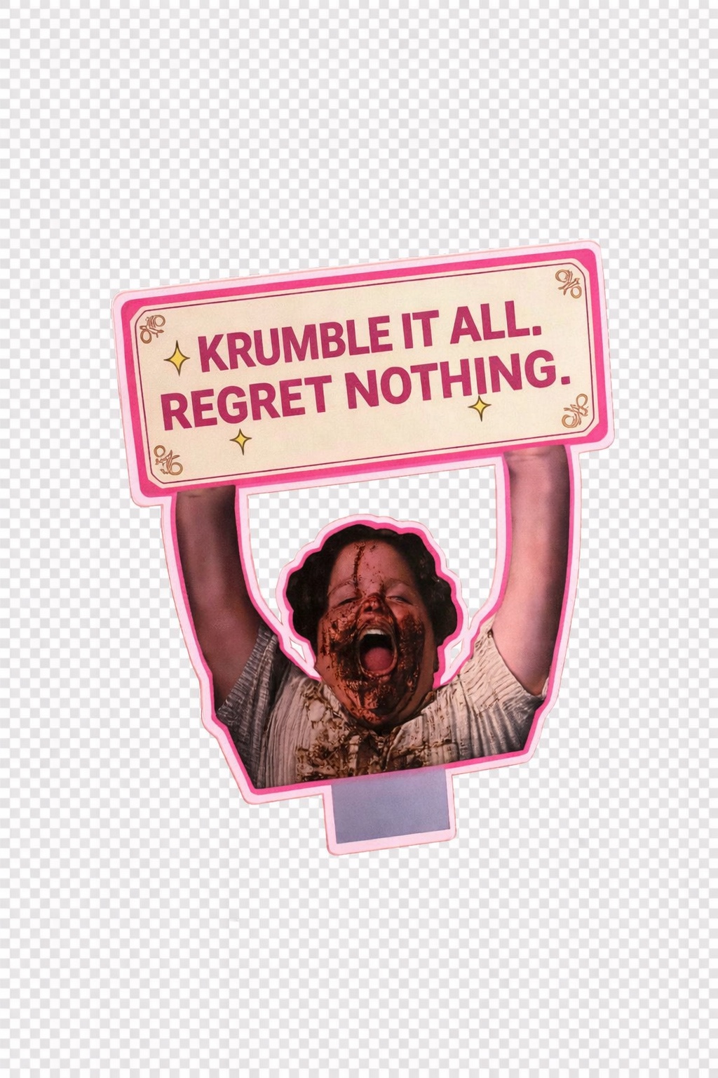
KRUMBLE IT ALL. REGRET NOTHING.
01 / The Direction
PLAYFUL. WARM. INDULGENT.
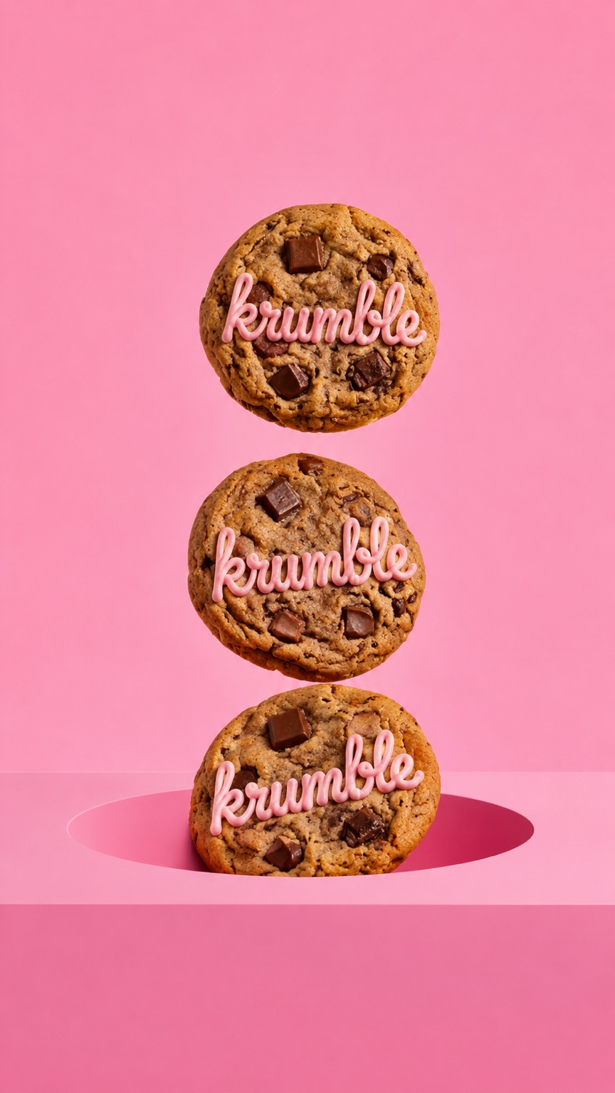
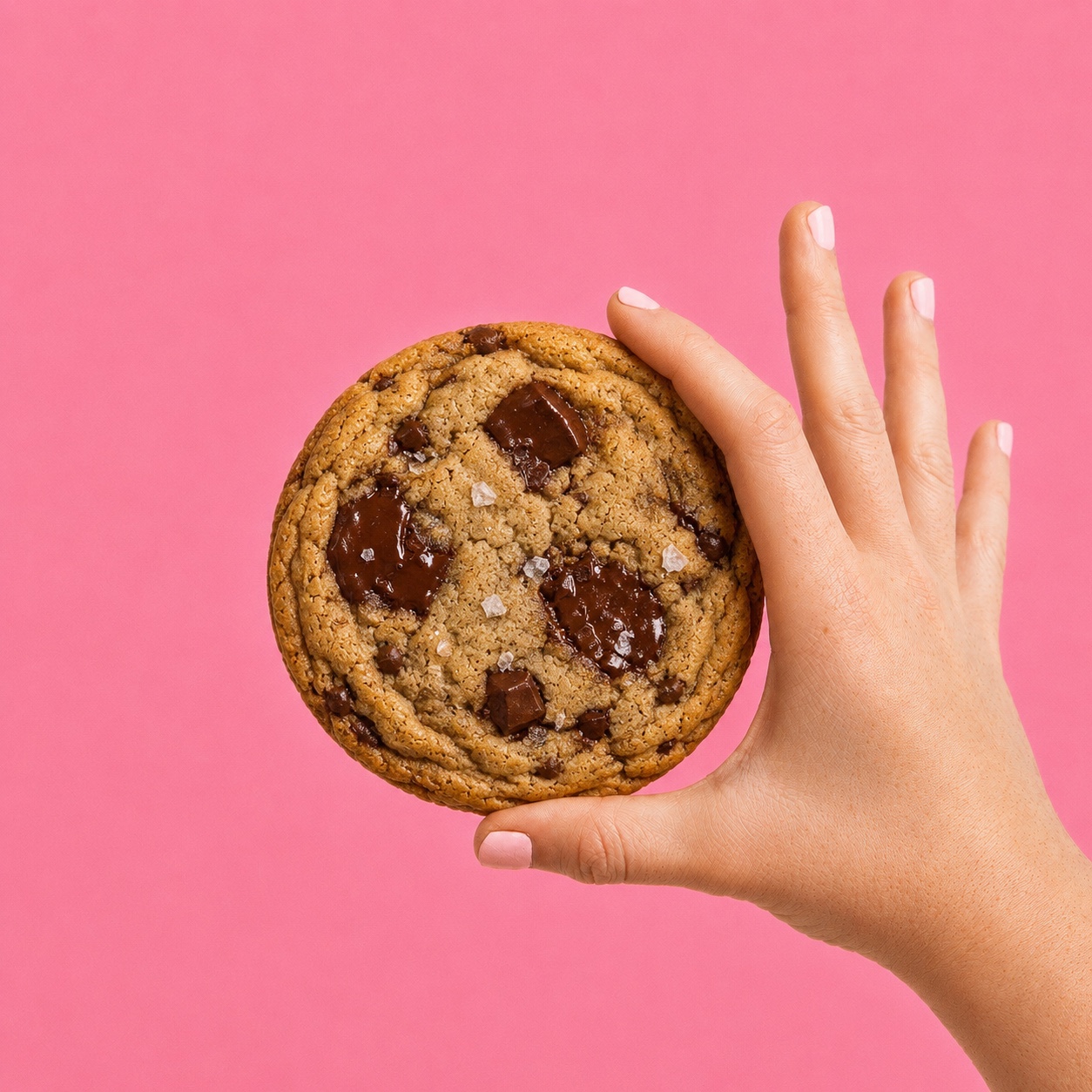
Krumble’s visual world leans into soft pinks, warm cream packaging, rich chocolate textures and playful details. The aim is to make the brand feel like a treat before the first bite.
02 / Packaging
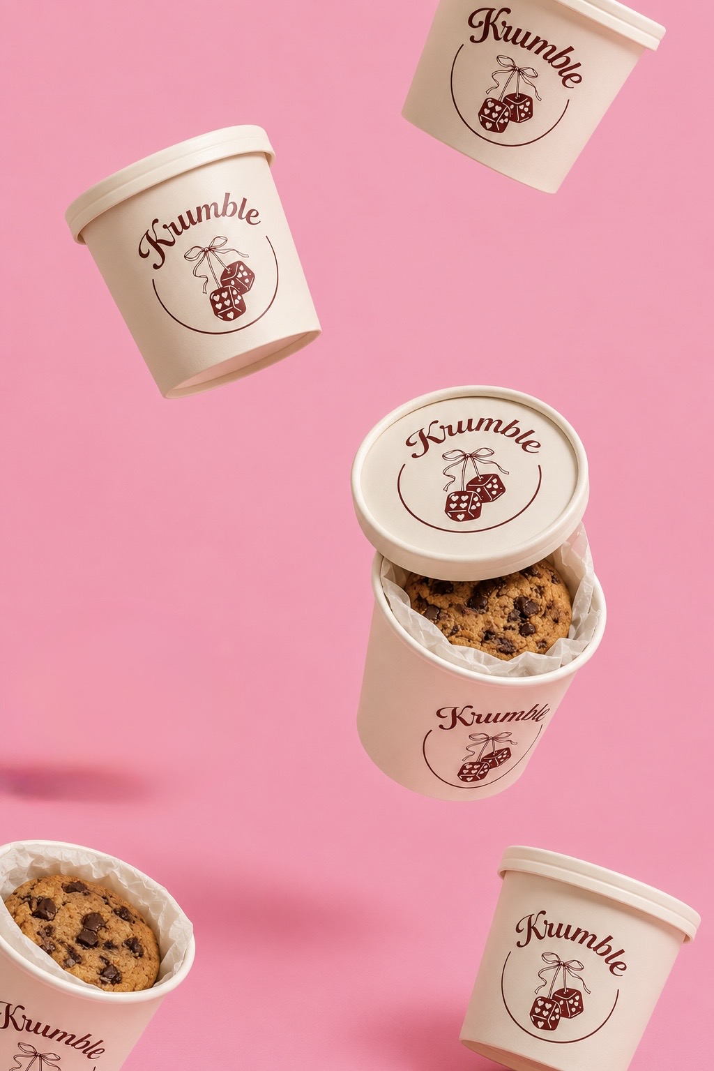
THE BRAND IN YOUR HAND.
The packaging keeps the identity simple and recognisable: cream containers, a deep brown Krumble mark and the dice illustration, all sitting naturally inside the pink visual system.
03 / Content
BUILT TO STOP THE SCROLL.
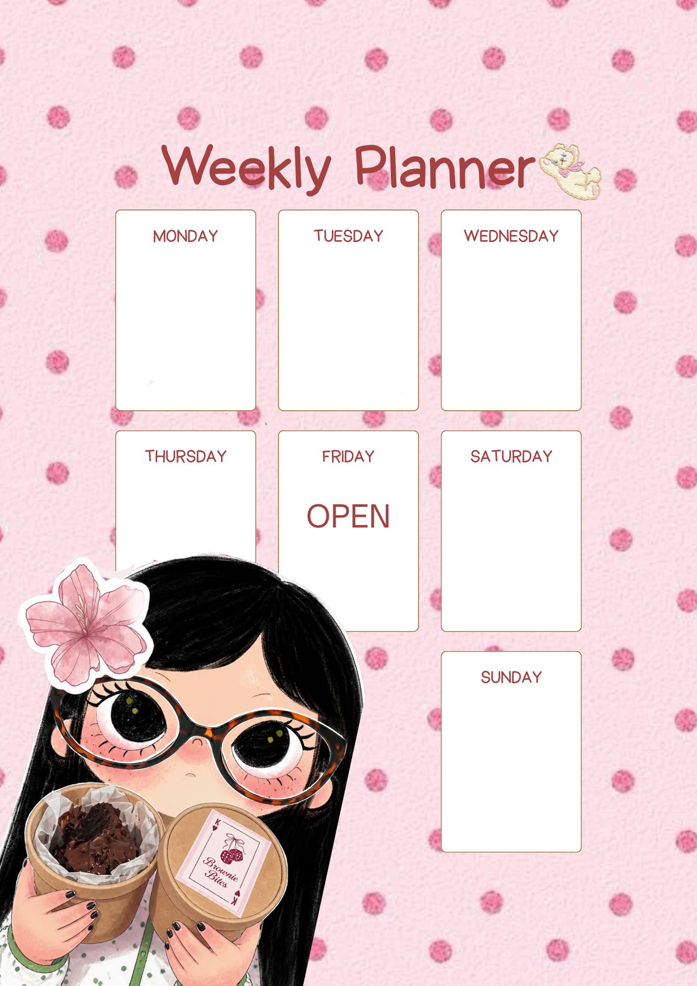
The content system mixes clean product photography with playful branded moments. It can move between polished product visuals, character-led content and everyday social posts without losing the Krumble personality.
04 / Brand Moment
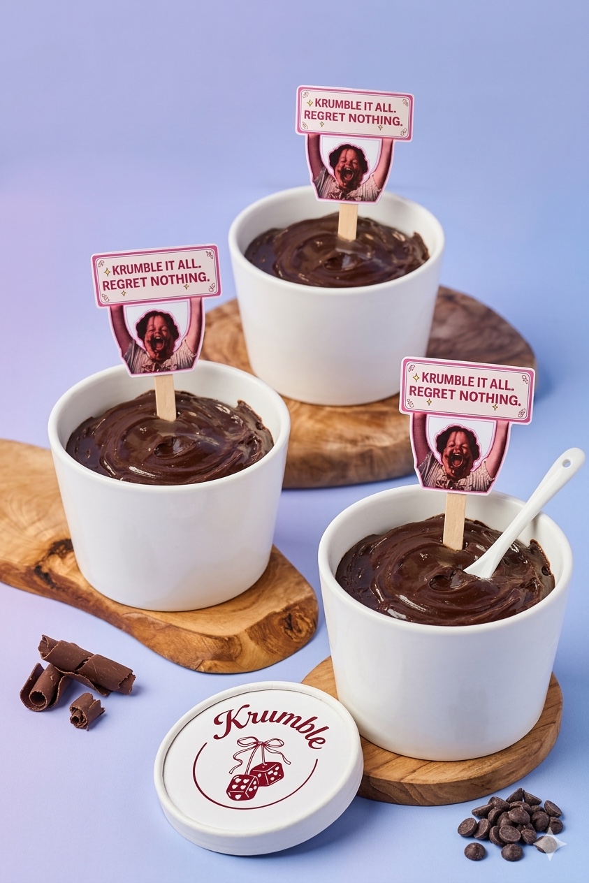
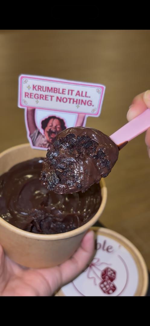
TURNING A BROWNIE INTO AN ATTITUDE.
The campaign line becomes part of the product experience itself. Rather than sitting only in advertising, “Krumble it all. Regret nothing.” appears inside the serving moment and gives the brand a more expressive voice.
05 / Visual System
A BRAND THAT CAN FLEX.
The same pink-and-cream identity carries across product photography, packaging, social templates and campaign details, creating a consistent visual language without forcing every execution to look identical.